
Turn your small business website into a lead-generating machine by mapping the fastest path from entry page to contact, then cutting it to 2–3 taps. Put a specific value promise and one high-contrast primary CTA above the fold, and repeat that CTA near benefits, pricing, and page endings. Add trust fast with reviews, testimonials, logos, and a clear guarantee. Use short, mobile-friendly forms, speed up load times, and track/test weekly for lift. Next, you’ll see exactly how to implement each step.
Key Takeaways
- Map the visit-to-contact path, remove friction, and keep conversion within 2–3 clicks, especially on mobile.
- Put a specific above-the-fold value proposition and primary CTA, limiting distractions and adding a secondary CTA only if needed.
- Repeat one consistent, high-contrast CTA across pages, aligned with visitor intent and placed near benefits, pricing, and decision points.
- Build trust with reviews, testimonials, logos, and clear guarantees placed next to CTAs to reduce hesitation and increase conversions.
- Track leads by page and source, then A/B test headlines, CTAs, and forms weekly to compound conversion gains.
Map Your Website’s Lead Path (Visit → Contact)
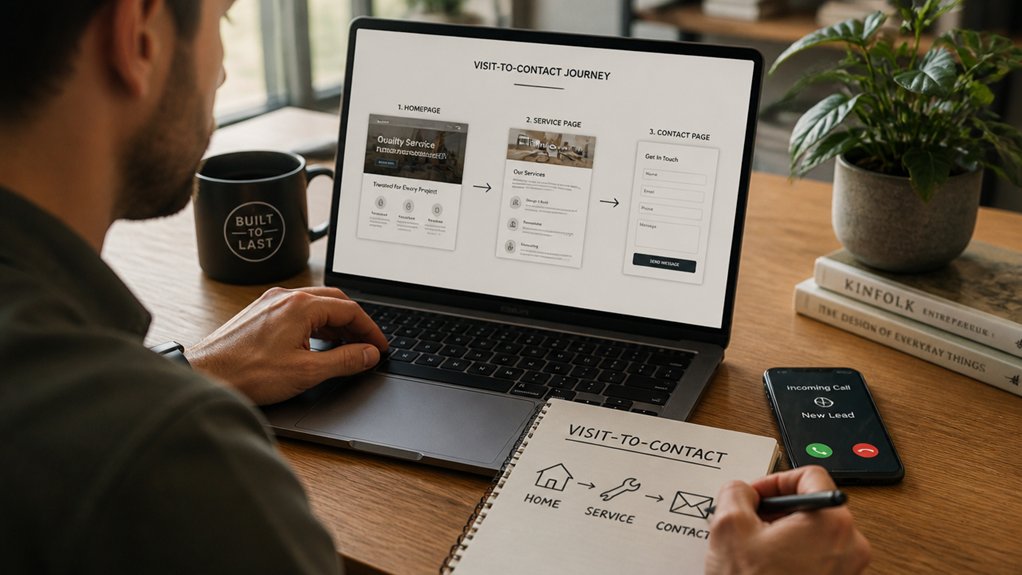
Before you add more traffic or redesign a single page, map the exact path a visitor should take from “I’m interested” to “I’ve contacted you.” Start by picking one primary conversion (form fill, call, or booking), then trace the shortest route to it from your top entry pages (homepage, service pages, blog posts, Google Business Profile links).
Document each step and count clicks. If it takes more than 2–3 taps to reach contact, you’ve got friction.
In analytics, check landing pages, exit rates, and where sessions drop off; that’s your Lead flow leak.
Then tighten your Conversion funnel: add consistent CTAs, remove dead-end pages, and keep navigation predictable.
Finally, test on mobile, because most leads start there.
Write a Clear Value Proposition Above the Fold
Once you’ve tightened the path to contact, the next bottleneck is whether visitors understand your offer fast enough to keep moving.
Above the fold, you’ve got seconds to earn attention, so lead with a specific promise: who you help, what outcome you deliver, and how you’re different. Don’t describe your business; state the result. Swap “quality service” for “Same-week bookkeeping that keeps your cash flow predictable.”
Aim for value clarity by using numbers, timeframes, or risk reducers (e.g., “24-hour response,” “fixed pricing,” “no long-term contract”). Keep message focus by cutting extra headlines, jargon, and competing claims.
Then test: run a five-second read with real customers and ask, “What do we do?” If they hesitate, rewrite.
Make One Primary CTA Impossible to Miss
You can’t expect leads if your main call-to-action is buried, so put one primary CTA above the fold where people decide in seconds whether to act.
Make it pop with high-contrast colors, clear button styling, and action-first copy that’s instantly scannable.
Then repeat that same CTA strategically down the page—after key benefits, proof, and pricing—so you catch visitors at the moment they’re ready to convert.
Place CTA Above The Fold
One clear call-to-action above the fold can lift conversions fast because it removes friction the moment a visitor lands. Put your primary button in the first screen on desktop and mobile, near the headline that states the value. That call to action placement shortens decision time and reduces scrolling drop-off.
Keep it singular: one main CTA, one outcome (book, get a quote, start a trial). Support it with a brief trust cue like “No credit card” or “Reply in 1 business day.”
Maintain design consistency by using the same CTA label and destination across pages, especially your homepage, service pages, and ads. Then measure: track clicks, form starts, and completions in analytics, and A/B test copy weekly.
If the fold moves, adjust layouts and keep the CTA visible.
Use High-Contrast Design
Getting your primary CTA above the fold sets the stage, but contrast is what makes it get clicked. If your button blends into the page, you’re asking visitors to work, and they won’t.
Use strong color contrast between the CTA and its surrounding background, and keep the rest of the palette quieter so the button wins every glance. Build clear visual hierarchy: one dominant button, supportive headline, minimal competing links.
Aim for accessibility too—meet WCAG contrast guidelines so every user can read and act.
Test it. Run an A/B test on button color and background; even small shifts in contrast can lift clicks meaningfully.
Also size and whitespace matter: a bigger target with breathing room gets noticed and tapped faster on mobile.
Repeat CTA Strategically
Even if your hero section nails the message, many visitors won’t scroll back up when they’re ready to act. Make one primary CTA impossible to miss by repeating it with purpose, not noise.
Use creative placement: add the same CTA in your sticky header, mid-page after benefits, and at the end near pricing or FAQs.
Match it to intent: early CTAs work for “book a call,” later CTAs convert comparison shoppers.
Apply timing strategies like a subtle exit-intent prompt or a 30–60 second slide-in on long pages, then cap frequency so it doesn’t annoy.
Keep copy identical, track clicks by location, and cut any CTA that underperforms.
Consistency boosts conversions and reduces decision friction.
Place CTAs Where Visitors Naturally Look

Because most visitors scan instead of read, your CTA has to show up in the spots their eyes land first—above the fold, near headlines, beside key benefits, and right after high-intent sections like pricing, testimonials, or service details.
Treat call to action placement like a measurable variable: move it, test it, and keep what lifts conversions.
Use visual hierarchy to make the button unmissable—strong contrast, ample whitespace, and a label that matches intent (Book a Call, Get a Quote, See Availability).
Align each CTA with the question in your visitor’s head at that moment, not your internal workflow.
If heatmaps show dead zones, don’t fight them; relocate the CTA to the hot path and reduce competing links.
Build a Homepage Layout That Drives Action
Your homepage layout should push visitors to act within seconds, so put a clear above-the-fold CTA where they can’t miss it.
Then back it up with trust signals—logos, ratings, testimonials, and guarantees—because proof reduces hesitation and lifts conversions.
When you pair a strong first-screen offer with visible credibility, you turn quick scans into real leads.
Above-The-Fold Call To Action
When a visitor lands on your homepage, you’ve got a few seconds to answer one question: “What should I do next?” An above-the-fold call to action (CTA) removes that friction by pairing a clear value proposition with a single, high-intent next step—like “Get a Quote,” “Book a Call,” or “Start a Free Trial”—before anyone scrolls.
Make the CTA impossible to miss with strong visual hierarchy: headline first, supporting line second, button third. Keep the button copy action-based and specific (“Book a 15-Min Call,” not “Submit”). Use color psychology to create contrast—one accent color for your primary button, repeated nowhere else.
Reduce choice paralysis by limiting above-the-fold links and adding a secondary CTA only if it targets a different intent. Track clicks, scroll depth, and form starts, then A/B test copy and button color weekly.
Trust Signals And Proof
A bold above-the-fold CTA tells people what to do next, but most won’t click until they trust you. Add proof right beside it: a short row of recognizable logos, a star rating, and one crisp promise (response time, warranty, or results).
Put Customer testimonials in scannable cards: name, company, specific outcome, and a photo if possible. Aim for numbers (“cut onboarding time 32%”) over adjectives.
Back it up with Industry certifications and memberships near the footer and on your contact section. Include security badges only if you actually process payments or store data.
Keep proof current; stale dates signal neglect. Finally, link testimonials to deeper case studies so skeptics can self-verify without leaving your conversion path.
Turn Service Pages Into “Yes” Pages
The fastest way to turn casual visitors into qualified leads is to make each service page answer one question: “Is this the right fit for me, and what happens next?” That means ditching vague descriptions and building “yes” pages that spell out outcomes, who the service is (and isn’t) for, what it costs or how pricing works, proof it delivers, and a clear next step.
Start with a one-sentence promise, then list 3–5 measurable outcomes (time saved, revenue lifted, errors reduced). Add “Best for” and “Not for” bullets to pre-qualify and cut junk inquiries.
Explain pricing with ranges, packages, or a simple formula so you don’t force calls for basics. Use service page optimization and conversion-focused copywriting to end with one CTA: book a consult, request a quote, or see availability.
Add Trust Signals Fast (Reviews, Proof, Guarantees)
You can have the best offer on the page, but if you don’t show proof, visitors won’t trust it. Put prominent social proof where decisions happen—near headlines, pricing, and CTAs—so prospects see real results without hunting.
Then add a clear, risk-free guarantee to remove hesitation and turn “maybe later” into “let’s do this.”
Prominent Social Proof
Even if your offer’s solid, most visitors won’t fill out a form until they see proof that people like them have gotten real results. Put that proof where decisions happen: above the fold, beside your primary CTA, and on key service pages.
Lead with 3–5 tight client testimonials that mention a specific problem, timeframe, and measurable outcome. Add names, photos, company logos, and role titles to increase credibility.
If you’ve got volume, show aggregate ratings (for example, “4.8/5 from 127 reviews”) and link to the source.
Layer in social endorsements: screenshots of LinkedIn comments, recognizable partner badges, publication mentions, or “used by” logos. Keep it scannable, and update quarterly so the proof stays fresh.
Risk-Free Guarantees
Why should a prospect take the leap today instead of “thinking about it” for another month? Because a clear, risk-free guarantee removes the biggest conversion killer: perceived downside.
Put it near your pricing and CTA, not buried in FAQs. Offer a 30-day money-back promise, a “first result or free” pledge, or a cancellation-anytime trial—then state exact terms in plain language.
Add proof beside it: review snippets, refund policy stats, and a short process graphic. This isn’t fluff; it’s measurable.
Guarantees typically lift opt-ins by reducing hesitation, and they support Customer retention by setting expectations upfront.
Tie it to brand storytelling: “We built this guarantee after seeing what customers feared most.” Track refund rate, churn, and lead-to-close.
Use Shorter Forms That People Actually Submit
If your contact form feels like a mini job application, prospects won’t bother finishing it. Every extra field adds friction, and friction kills leads. Start with short forms: name, email, and one optional “How can we help?” box. You can always qualify later on the call.
Use data to decide what stays. Track completion rate, time to submit, and drop-off by field. If “company size” or “budget” doesn’t change your next step, cut it.
When you do need more detail, use smart defaults, conditional fields, or a two-step form that asks the easiest question first. You’ll see more user submissions because the path feels quick, low-risk, and respectful of their time.
Test weekly and keep what wins.
Fix Mobile Speed and Tap-to-Call Conversions
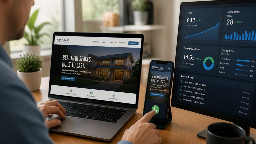
Because most of your mobile visitors come with high intent and low patience, your site needs to load fast and make calling effortless. Aim for under 2 seconds on 4G; every extra second costs conversions.
Start with Mobile optimization basics: compress images, serve WebP, lazy-load below the fold, and strip heavy plugins. Minify CSS/JS, defer noncritical scripts, and use a CDN if you’re local but get regional traffic.
Then make the phone path frictionless. Put your number in the header and sticky footer, format it as a clickable tel: link, and label the button “Tap to call.” Make it thumb-friendly (44px+ height), high-contrast, and never hidden behind chat widgets.
For service businesses, this alone boosts inquiries fast.
Track Leads, Test Changes, and Improve Weekly
Once you’ve fixed speed and click-to-call, you need a simple weekly loop that turns your website into a measurable sales channel: track every lead source, run one focused test at a time, and keep what moves inquiries up.
Set up Conversion analytics to log form fills, calls, chats, and bookings, then tag each by channel and page.
Use Lead segmentation to separate high-intent leads (service pages, pricing clicks) from low-intent browsers (blog-only visits).
Every Monday, pull a 7-day report: sessions, conversion rate, cost per lead, and close rate by segment.
Pick one hypothesis—new headline, shorter form, stronger CTA, trust badges—and A/B test it.
On Friday, ship the winner, document the change, and queue the next test.
Repeat, no guesswork.
Conclusion
Turn your website into a lead engine by guiding visitors, clarifying value, and removing friction. You map the path, you sharpen the promise, you spotlight one CTA. You place it where eyes go, you back it with proof, you keep forms short. You speed up mobile, you make calling effortless. Then you measure what matters—clicks, submissions, calls—and you test weekly. Do that, and you won’t just get traffic—you’ll get leads.
About the Author