
You create a professional small business website that converts by choosing one primary goal (call, form, or booking) and designing every page to support it. Put a clear value proposition and high-contrast CTA above the fold, then reinforce it with benefits-focused copy, FAQs, real photos, and testimonials near conversion points. Keep navigation to 5–6 items, build mobile-first layouts, and improve speed with compressed images and minimal plugins. Next, you’ll see how to structure each page for higher response.
Key Takeaways
- Define one primary conversion goal (call, form, or booking) and structure pages to drive that action with minimal friction.
- Put a specific above-the-fold value proposition: what you do, who it’s for, and the measurable outcome you deliver.
- Use prominent, high-contrast CTAs above the fold and after key sections, supported by microproof like “no obligation” or ratings.
- Write benefit-led, skimmable copy with numbers, timeframes, and FAQs that address objections and clearly explain your process and service area.
- Add strong trust signals near CTAs—real testimonials, team/work photos, licenses/insurance, and a clear guarantee—while keeping the site mobile-fast.
Choose One Conversion Goal (Calls, Forms, Bookings)

Before you pick colors, pages, or plugins, decide what you want a visitor to do first: call you, fill out a form, or book an appointment. Pick one primary action and treat everything else as secondary, so your copy, layout, and tracking all reinforce a single decision path.
If you need calls, surface tap-to-call and hours, and measure qualified conversations.
If you need forms, ask only what you’ll use, route leads fast, and track completion rate.
If you need bookings, show real availability, set buffer rules, and track show-up rate.
Use Customer segmentation to tailor the first prompt by intent (new vs returning, service area, device).
Apply Content personalization to adjust headlines and CTAs without changing the goal.
Map the Pages You Need (and What Each Does)
Once you’ve picked your conversion goal, you need a page map that guides visitors to it without friction. Start with essential core pages—Home, Services, About, Contact—each with a clear job and a direct path to your primary action.
Then add conversion-focused supporting pages like FAQs, pricing, case studies, and landing pages to answer objections, build trust, and capture intent where it’s strongest.
Essential Core Pages
Although your design and branding matter, your website succeeds or fails based on whether visitors can find what they need in seconds.
Start with a clear Home page that states who you help, what you do, and what to do next.
Add a Services (or Products) page that explains offerings, outcomes, pricing ranges, and process without burying the lead.
Include an About page that proves credibility with your story, differentiators, and qualifications.
Publish a Contact page that makes reaching you effortless with a short form, direct email, phone, hours, and location if relevant.
Support all core pages with consistent navigation, scannable headings, and fast-loading layouts.
Maintain Typography consistency and a cohesive Color palette so users recognize patterns and move confidently between pages.
Conversion-Focused Supporting Pages
Where do visitors go after they’ve skimmed your core pages and still need one more nudge to trust you, understand the details, or take action? You guide them with supporting pages that remove friction and answer specific objections fast.
Map pages to intent: a Services Detail page clarifies scope, deliverables, and pricing ranges; a Case Studies page proves outcomes with metrics; a Testimonials page adds social proof; an FAQ page handles common hesitations; a Process page sets expectations; a Contact or Booking page closes with one primary CTA.
Add a Policies page to reduce risk, and a Resources page to nurture leads.
Use Content personalization to surface the right supporting page based on referrer, behavior, or segment, keeping each user journey tight, logical, and conversion-focused.
Pick a Platform That Fits Your Budget and Skills
Two factors should drive your platform choice: what you can afford now and what you can realistically maintain without hiring help. If you’re cash-tight, start with a reputable hosted builder (Squarespace, Wix) that bundles security, updates, and templates, so you can ship fast without technical debt.
If you need deeper SEO control, custom integrations, or content scale, choose WordPress with managed hosting, but budget for upkeep and occasional developer time. Prioritize tools that let you apply strong design aesthetics and protect branding consistency through global styles, reusable sections, and locked templates.
Check total cost of ownership: subscriptions, plugins, payment fees, and time. Finally, confirm you can edit pages, add forms, and publish updates in under 10 minutes.
Write a Homepage Headline People “Get” in 5 Seconds
Your homepage headline has about five seconds to tell visitors why they should stay, so lead with a clear value they can recognize instantly.
Specify who it’s for so the right people feel addressed and the wrong people self-filter fast.
Keep it short and specific—concrete outcomes beat clever slogans every time.
Lead With Clear Value
If a visitor can’t tell what you do and why it matters within five seconds, they’ll bounce—no matter how polished the design looks.
Your headline has one job: deliver a clear value proposition in plain language. Lead with the outcome you create, not your company name or vague claims like “quality service.” Use specific verbs and measurable benefits: save time, reduce costs, get faster approvals, book in minutes.
Support the headline with a tight subhead that explains how you deliver that result, then add a single primary call to action.
This structure reduces cognitive load, sharpens scanning behavior, and lifts user engagement.
Finally, test variations: shorter beats clever, and clarity beats hype every time.
Specify Who It’s For
A clear value proposition gets attention, but it lands harder when visitors instantly see they’re the intended customer. Your homepage headline should signal the target audience without making them hunt for clues. Name the category of buyer you serve, reflect their context, and align the promise with what they’re already trying to solve.
When people self-identify in seconds, they keep reading; when they hesitate, they bounce.
Support that headline with tight cues: a hero image that mirrors your customer’s environment, a subhead that echoes their priorities, and navigation labels that match their mental model. Maintain branding consistency so the message feels trustworthy across pages, not like a one-off claim.
If your words, visuals, and offers point to the same buyer, you’ll convert more of the right traffic.
Keep It Short, Specific
Because most visitors scan instead of read, the homepage headline has to land fast: state what you do, for whom, and the outcome in one tight line. Keep it under 10–12 words, avoid jargon, and lead with a concrete result (“Book more,” “Cut costs,” “Get approved”).
If you can’t say it clearly, you probably don’t offer it clearly.
Use specifics that prove relevance: industry, location, or primary service. Pair the headline with a subhead that adds one qualifier, not a paragraph.
Your color schemes and font choices should support speed: high contrast, clean type, and enough spacing to read on mobile. Don’t bury the point in cleverness.
Test two versions, measure clicks to your primary CTA, and keep the winner.
Build a Simple Site Menu That Guides Decisions
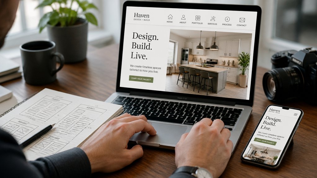
While your homepage draws attention, your site menu drives action by showing visitors exactly where to go next. Aim for navigation simplicity: limit top-level items to five or six, name them with plain language, and reflect the questions customers ask.
Build a clear menu hierarchy by ordering links from highest intent to lowest—Services, Pricing, About, Resources, Contact—so scanning feels effortless. Keep labels consistent across pages, and avoid clever terms that force interpretation.
Use one primary call-to-action link (like “Book a Call”) and style it subtly different so it stands out without clutter. If you have more content, group it under logical dropdowns, but don’t nest beyond one level.
Test your menu on mobile to make certain taps stay accurate.
Design Above-the-Fold Sections That Drive Leads
Above the fold, you’ve got seconds to communicate why you’re the best choice, so state your value proposition in one sharp, specific line.
You’ll convert more visitors when you pair that promise with proof cues—like a key benefit or outcome—without forcing them to scroll.
Then you’re ready to place a prominent call-to-action that matches their intent and makes the next step obvious.
Craft A Clear Value Proposition
If you want more leads from your small business website, your value proposition has to land instantly in the above-the-fold section. State what you do, who it’s for, and the measurable outcome you deliver, all in one tight headline and one supporting line.
Avoid vague claims like “quality service”; replace them with specific differentiators you can prove. Use Unique branding to signal credibility at a glance: consistent logo, color, and tone that match your market and price point.
Reinforce clarity with a simple visual that shows the result, not the process. Then validate the promise with one trust element—certification, rating, or short testimonial—so visitors don’t have to infer value.
Keep it scannable to sustain customer engagement and reduce bounce.
Add A Prominent Call-To-Action
Once your value proposition clicks, you need to tell visitors exactly what to do next—immediately and without friction.
Place a single, primary call to action above the fold, where it’s visible before scrolling. Use action-first copy (“Get a quote,” “Book a call”) tied to the benefit you promised.
Make the button high-contrast, large enough for thumbs, and surrounded by whitespace so it reads as the next logical step.
Reduce decisions by limiting competing links and keeping navigation minimal in the hero area.
Support the CTA with microproof: a short testimonial, trust badges, or “No obligation” language to lower perceived risk.
Treat this as one of your core conversion strategies, then A/B test copy, color, and placement.
Write CTAs That Get Clicks and Phone Calls
Because most visitors skim and decide in seconds, your calls to action (CTAs) need to tell them exactly what to do and make it effortless to do it. Use specific verbs and outcomes: “Call now for a same-day estimate,” not “Contact us.”
Place your primary button above the fold and repeat it after key sections, so the next step is always within reach. Build Call to action strategies around intent: clicking for details, booking, or calling.
For phone leads, show a tap-to-call number, label it (“Speak to a technician”), and match it with business hours.
Add Trigger phrases that reduce friction—“Get a quote in 2 minutes,” “No obligation,” “Talk to a real person.” Then A/B test wording and button color to lift response rates.
Use Copy Blocks That Sell (Benefits, Objections, FAQs)
Strong CTAs tell visitors what to do next, but the copy around them convinces them it’s worth doing. Build focused copy blocks that answer “why you,” “why now,” and “what happens next.” Lead with benefits, not features: translate services into outcomes, time saved, risk reduced, or revenue gained.
Use effective copy that stays specific—numbers, timeframes, and clear deliverables beat vague promises.
Next, preempt objections in a short “You might be wondering…” section. Address price, timeline, fit, and effort required, and explain your process in plain steps.
Then add an FAQ that mirrors real search intent and removes friction: hours, service area, what’s included, and how to prepare.
Use persuasive language, but keep it factual and skimmable with subheads, bullets, and tight sentences throughout.
Add Trust Signals: Reviews, Photos, Credentials, Guarantees
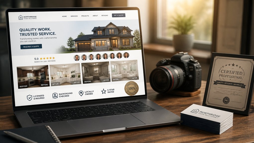
Even if your offer is clear and your CTA is compelling, most visitors still look for proof before they reach out. Add trust signals that answer, “Can I rely on you?”
Start with Customer testimonials that include names, photos, and specific outcomes, not vague praise. Place 2–3 near key conversion points and link to full reviews for transparency.
Use real photos of your team, workspace, and finished work to reduce perceived risk and set accurate expectations.
Display Credential badges for licenses, insurance, industry memberships, and secure payment where relevant, but keep them current and verifiable.
Finally, offer a clear guarantee or risk-reversal policy, written in plain language, with limits stated upfront so you don’t overpromise.
Make the Mobile Version Your Primary Design
If you design for mobile first, you’ll build a site that loads faster, reads cleaner, and converts better on the devices most visitors actually use. Start with the smallest screen so every element earns its place: one primary goal per page, a single clear CTA, and short, scannable sections.
Use generous tap targets, obvious form labels, and minimal fields to reduce friction. Keep navigation simple with a sticky header and a focused menu that mirrors how customers decide.
Treat Mobile responsiveness as nonnegotiable: test across common screen sizes, orientations, and thumb reach zones.
Make Design prioritization explicit by ranking content by intent—what visitors need now, next, and later—then progressively enhance for tablets and desktops without changing the core path to conversion.
Speed Up Load Time (Images, Hosting, Plugins)
Because load time shapes both your search visibility and your visitors’ patience, you should treat performance as a core feature—not a final polish step.
Start with Image optimization: compress and resize every photo to its display dimensions, serve modern formats, and lazy-load below-the-fold media.
Next, audit your hosting. Cheap plans buckle under traffic spikes, so prioritize Hosting reliability, SSD storage, and a nearby data center; add a CDN if you serve wider regions.
Then trim your plugins and scripts. Delete anything you don’t use, replace heavy page builders with lighter blocks, and avoid redundant tracking tools.
Finally, enable caching and minification through your host or a single performance plugin, and test changes with real-device loading, not just scores alone.
Cover SEO Basics: Titles, Locations, Services, Internal Links
When you treat SEO as part of your site’s structure—not a marketing add-on—you make it easier for search engines and customers to understand exactly what you offer.
Write page titles that pair your core service with your city or service area, and keep each title distinct.
Build dedicated pages for primary services, then add location modifiers in headings and copy where they’re genuinely relevant.
Use Keyword research to confirm what people actually search, then map one main query to one page to avoid cannibalization.
Strengthen internal links by connecting service pages to related FAQs, project examples, and contact pages with descriptive anchor text.
Support all of this with selective backlink strategies that point to your highest-intent service and location pages.
Track and Improve: Calls, Forms, Heatmaps, A/B Tests
Even after you’ve nailed your SEO structure, you won’t know what’s actually driving revenue until you track real conversion signals and iterate. Set up Call tracking with unique numbers by channel so you can tie leads to pages, ads, and keywords. Treat every form as a measurable event: capture source/medium, log drop-offs, and monitor completion rate by device.
Then run heatmap analysis to see where visitors hesitate, rage-click, or ignore your primary CTA. Use those insights to form hypotheses and A/B test one change at a time—headline, offer framing, button copy, layout, or trust badges. Keep tests long enough to reach statistical confidence, and stop changing multiple variables at once.
Review results monthly, ship wins quickly, and document what moved calls, form submits, and revenue.
Conclusion
You’ve built more than pages—you’ve built a path. When you choose one conversion goal, map purposeful pages, and pick a platform you can actually manage, your site starts working like a well-lit storefront: clear, fast, and inviting. With a five-second headline, decision-focused navigation, mobile-first design, and solid speed and SEO fundamentals, you remove friction. Then you measure what matters—calls, forms, bookings—and refine with heatmaps and tests until results compound.
About the Author