
If you want more enquiries, start by removing friction on your website. Pick one primary enquiry goal, then make your offer obvious above the fold with a single, consistent CTA. Cut forms to the essentials, add service-specific testimonials and trust badges near submit buttons, and show pricing ranges to reduce hesitation. Speed up mobile load times by compressing images and deferring scripts. Fix local SEO with consistent NAP and GBP updates—next, you’ll see exactly what to optimise first.
Key Takeaways
- Audit top landing pages for high traffic but low enquiries, then fix unclear messaging, weak CTAs, and high exit rates.
- Simplify enquiry forms to essentials, make them mobile-friendly, and place them prominently to reduce friction and abandonment.
- Choose one primary enquiry goal and align every page, headline, and call-to-action to drive that single action.
- Improve trust signals near CTAs with reviews, guarantees, transparent pricing ranges, and verified badges to reduce hesitation.
- Speed up your site and track results using Core Web Vitals, UTMs, click-to-call tracking, and CRM data to find what converts.
Find What’s Blocking Website Enquiries

If your website traffic looks healthy but enquiries stay flat, something in your funnel is blocking people from taking action. Start by checking intent match: do top landing pages answer the query that brought visitors in? In analytics, compare high-traffic pages against low click-through to contact actions, short time-on-page, or high exits.
Next, audit friction. Your forms might be too long, your phone number buried, or your mobile layout breaking. Website aesthetics matter: cluttered pages and weak hierarchy hide the next step. Check Core Web Vitals and page speed; slow loads kill conversion.
Finally, review Content freshness. Outdated offers, stale testimonials, and old pricing reduce trust. Track changes weekly and retest.
Choose the One Enquiry Goal That Matters Most
Pick one primary enquiry you want most—book a call, request a quote, or buy—because chasing three goals usually cuts conversions.
Define that single action in plain terms and track it as your headline metric.
Then align every key page to drive that goal with one clear CTA, tight copy, and zero competing exits.
Define Your Primary Enquiry
Before you redesign a page or tweak a call-to-action, lock in the single enquiry outcome your website must produce most reliably—because “more enquiries” isn’t a goal you can measure or optimise.
Decide what “good” looks like: booked consultation, quote request, callback, demo, or in-store appointment. Pick one based on revenue impact and sales capacity, not guesswork.
Use your CRM and analytics to confirm which enquiry type closes fastest, at the highest value, with the lowest admin time. That’s your Primary focus.
Then write a one-sentence goal you can track: “Generate X qualified [enquiry type] per month from the website.” This is Goal clarity.
Everything else becomes a secondary conversion, not your core KPI. Document it and brief your team.
Align Pages To Goal
Where do your pages actually send people when they’re ready to act? If each page pushes a different action—call, email, quote form, booking link—you dilute intent and lose enquiries. Pick the one enquiry goal that matters most, then align every page to it.
Audit your top landing pages and navigation. Make the primary CTA identical in wording and destination to enforce Content consistency. Put it above the fold, repeat it mid-page, and again near the end.
Use visual hierarchy: one dominant button style, high contrast, and clear spacing so it’s the obvious next step. Strip competing links from hero sections and sidebars.
Track clicks, form starts, and completions; if a page’s CTA underperforms, fix layout before adding more content. Consistency converts.
Make Your Small Business Website Offer Instantly Clear
You’ve got seconds to tell visitors what you do and who it’s for, so state your core offer in one plain-language line above the fold.
Then surface 2–3 concrete benefits fast (time saved, cost reduced, risk removed) so they can self-qualify without hunting.
If they can’t repeat your offer after a five-second scan, you’re losing enquiries.
Clarify Your Core Offer
Although your site might look polished, it won’t generate enquiries if visitors can’t tell what you do—and who it’s for—within a few seconds. Your job is to remove guessing. Write one plain-English headline that states your service, your audience, and your location or delivery mode. Back it with a short subhead that explains the outcome in concrete terms, not buzzwords.
Audit every page for content clarity: if a stranger can’t summarise your offer after a 5‑second scan, rewrite. Keep navigation labels literal (e.g., “Accounting for Trades” beats “Solutions”). Maintain branding consistency so the same words, tone, and offer appear in your header, hero, and contact sections.
If you provide multiple services, lead with your primary revenue driver and group the rest under one menu item.
Highlight Key Benefits Fast
How quickly can someone see the payoff of working with you? On your homepage, you’ve got 5 seconds to answer that.
Lead with 2–3 benefits, not features: “Cut admin time by 30%,” “Get quotes in 24 hours,” “Book online in 60 seconds.” Put them above the fold, in plain language, and repeat them near your main CTA.
Use Visual branding to support the promise: one hero image that shows the outcome, consistent colours, and a single focal point.
Then back it up with proof: a stat, testimonial, or short case result.
Your Content strategy should prioritise skimmability—headlines, bullets, and microcopy that matches search intent.
If benefits aren’t instantly obvious, visitors bounce and enquiries drop fast.
Put Your Main CTA Above the Fold
Because most visitors decide within seconds whether to stay or bounce, your main call-to-action needs to sit above the fold—visible without scrolling—so they can take the next step immediately. If it’s buried, you’re forcing extra effort, and effort kills conversions.
Make the CTA specific and low-friction: “Get a Quote,” “Book a Call,” or “Check Availability.” Place it near your headline, repeat it in the top navigation, and keep it visually dominant with contrast and whitespace.
On mobile, ensure it’s still above the fold and tappable (44px+ targets). Remove competing buttons that split attention.
Then test: track clicks with analytics, run an A/B test on copy and colour, and watch enquiry rate, not vanity metrics like pageviews.
Create One High-Converting Page Per Service
A strong above-the-fold CTA gets the click, but your service page has to earn the enquiry. Build one page per service, not one catch-all list. It improves relevance, lowers bounce, and gives analytics clean signals on what converts.
Match the headline to the search intent, then prove you’re the right choice fast: outcomes, process, timelines, and proof. Use Content diversification to answer different buyer questions—short explainer copy, a quick checklist, FAQs, and a tight case snippet—without turning it into a blog.
Keep Branding consistency across pages so users don’t feel they’ve landed somewhere else: same voice, layout, and trust badges.
Finish with one form, one primary CTA, and remove competing links.
Answer Pricing Questions Early (Even With Ranges)
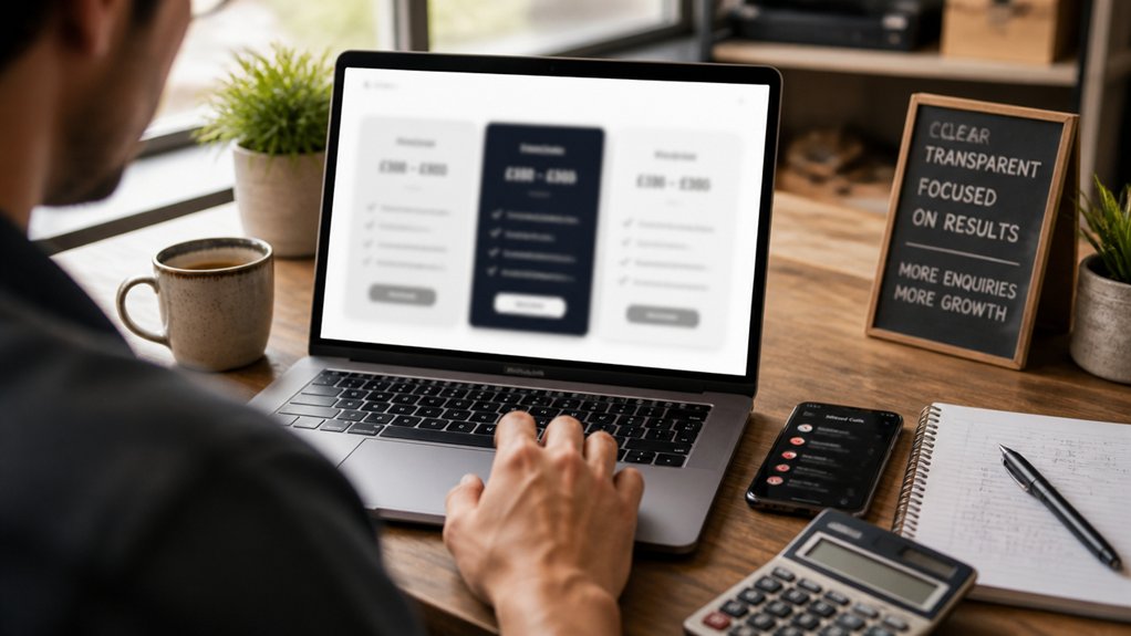
If you hide pricing until the last step, you’ll pay for it in low-quality enquiries and wasted follow-ups. Most visitors want a fast yes/no before they contact you, so give them pricing transparency upfront. You don’t need perfect quotes; you need clear boundaries.
Add “from” pricing, package tiers, or common project bands (e.g., $800–$1,500) tied to scope drivers like size, urgency, and inclusions. That filters out mismatches and improves lead-to-sale rate because only qualified prospects submit.
Use inquiry ranges on each service page and near your primary CTA: “Most projects land between X and Y; book a call for an exact quote.” Then list what changes price. You’ll cut back-and-forth and shorten your sales cycle substantially.
Add Reviews, Guarantees and Badges Near Forms
Place trust signals right next to your enquiry form—recent reviews, star ratings, and testimonials cut perceived risk at the decision point.
Add a clear money-back guarantee in plain language so people know exactly what happens if you don’t deliver.
Include security and relevant association badges near the submit button to reduce hesitation and push more users to complete the form.
Display Trust Signals Nearby
Because most visitors hesitate right at the point of form submission, you’ll win more enquiries by putting trust signals directly beside your form, not buried on another page.
Place 1–2 Customer testimonials within the same screen as the fields, ideally with a name, suburb, and specific outcome. Add star ratings or a review count if you’ve got them.
Use Trust badges that match your real risk points: secure payment, verified business, industry memberships, or insurance. Keep badges small, monochrome, and consistent so they look legitimate, not spammy.
Put them under the submit button or next to sensitive fields like phone and budget. If you’re tracking conversions, A/B test badge placement and testimonial length; small changes here often lift form completions without increasing traffic.
Highlight Clear Money-Back Promise
Trust signals reduce doubt, but a clear money-back promise removes the last bit of perceived risk right before someone hits submit.
Put the promise beside your enquiry form, not buried in FAQs, so it’s seen at the decision point. Use plain terms: “30-day money back guarantee—no questions asked” or specify what’s covered and how refunds work.
Add one short line of customer reassurance under the CTA: “If it’s not right, you get your money back.” Pair it with 1–2 recent review snippets right above the form, ideally outcome-focused.
Keep the promise scannable: bold the timeframe, state the trigger, and link to full terms. The goal is to reduce hesitation, improve form completion, and lift enquiry quality.
Remove ambiguity, and you’ll see more submissions.
Add Security And Association Badges
When you ask someone to share contact details, you’re asking them to take a small but real risk, so you need to lower perceived risk at the exact point of action. Put trust signals beside your enquiry form, not buried in the footer.
Add Security badges (SSL, payment provider, privacy compliance) right under the submit button, and keep them small but recognisable.
Back them up with proof. Place a short review snippet (star rating + count) and a guarantee line near the form, so visitors don’t have to hunt.
If you’re accredited, show association logos with a link to verification.
Measure it. A/B test form conversions with and without badges; track abandonment on mobile. If lift is under 3%, refine placement, not more badges.
Make Your Contact Page Impossible to Miss
Even if your service is excellent, you won’t get enquiries if visitors can’t instantly find a way to reach you. Make Contact accessibility non-negotiable: put “Contact” in your primary navigation, keep it in the header on mobile, and add a persistent call button for tap-to-call.
Use visual cues that reduce scanning time—contrasting colour for the Contact link, a clear phone icon, and a short “Get a quote” CTA near the top of key pages.
Add your email, phone, suburb, and hours above the fold, then repeat them in the footer site-wide.
Track it: watch click-to-call, email taps, and contact-page visits in analytics. If those events are low, your contact options aren’t visible enough.
Cut Your Enquiry Form to the Minimum Fields
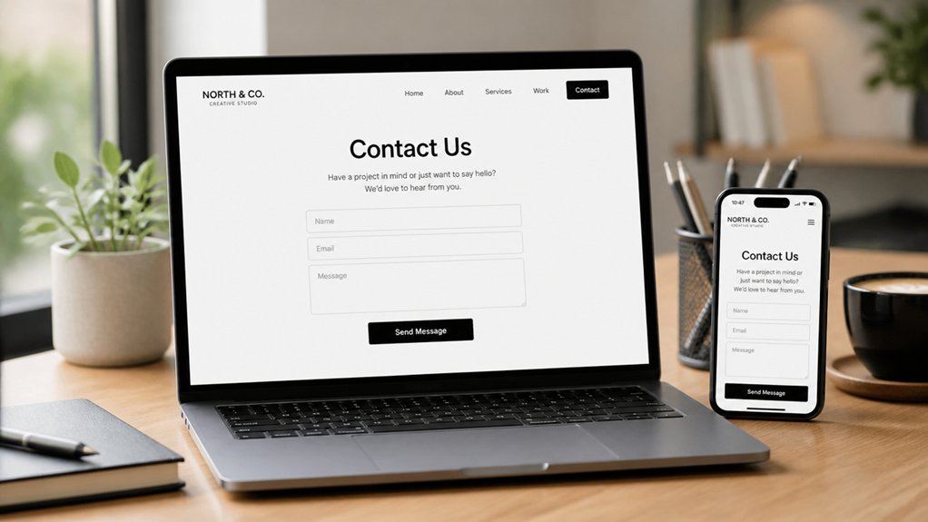
Once people can actually find your contact options, the next conversion killer is a long, fussy enquiry form. Every extra field adds friction and drop-off, especially on mobile. You don’t need a “perfect brief” to start a conversation; you need a replyable lead.
Strip the form to what you’ll act on today: name, email or phone, and one open text box. If you must qualify, use a single dropdown (service type) and keep everything else optional.
Lean on user intuition: labels should be obvious, errors clear, and the submit button unmistakable. Apply minimalist design: fewer inputs, larger tap targets, and no captchas that punish real prospects.
Then measure: track form starts vs submits and cut anything that doesn’t lift completion.
Add Testimonials That Match Each Service
Although a generic “great service!” review looks nice, it rarely converts—so match testimonials to each service page and to the buyer’s exact concern.
If you offer web design, feature results about lead growth, timelines, and communication. If you offer SEO, show rankings, traffic lifts, and revenue impact. Specificity reduces perceived risk and shortens decision time.
Pull Customer feedback from past clients and tag it by service type, industry, and pain point. Then place 2–3 tightly relevant quotes near the call-to-action, not buried on a single “testimonials” page.
Use numbers, before/after context, and identifiable details (role, company, location) to increase credibility. Refresh Service reviews quarterly, and A/B test which proof blocks drive more form submissions.
Speed Up Your Small Business Website on Mobile
How fast does your site load on a phone—really? If it’s over 3 seconds, you’re likely bleeding enquiries. Check Core Web Vitals and run PageSpeed Insights on real mobile, not desktop emulation. Your goal: fast page load times under typical 4G conditions.
Start with the biggest wins: compress and resize images (WebP/AVIF), lazy-load below-the-fold media, and cut third-party scripts you don’t need. Minify CSS/JS, defer noncritical files, and enable server-side caching plus a CDN.
Keep your design lightweight while maintaining Mobile responsiveness: avoid heavy sliders, huge hero videos, and bloated page builders. Test every key page after changes, and track bounce rate and form-starts to confirm speed’s lifting conversions.
Fix Local SEO to Drive More Website Enquiries
If your business serves a specific area, local SEO decides whether nearby customers find you or your competitors when they search “near me.” Start by tightening the basics that directly influence enquiries: fully optimise your Google Business Profile, lock your NAP (name, address, phone) to one consistent format across your site and key directories, and build service/location pages that match real search terms.
Next, prove relevance and trust. Add schema markup (LocalBusiness), embed a Google Map, and show your service radius clearly. Collect reviews consistently and reply with location and service cues—this lifts conversion, not just rankings.
Earn local links from chambers, suppliers, and community sites; they’re stronger than generic backlinks for a Local business. Finally, write title tags and headings with suburb + service, and keep your SEO strategies focused on intent, not vanity keywords.
Track Enquiries and Double Down on What Works
Where are your best enquiries actually coming from—organic search, Google Business Profile, paid ads, or referrals? You won’t know unless you track them. Set up Conversion analytics: form submissions, click-to-call, email taps, and booking completions. Use UTM links on campaigns and a tracked phone number so every lead has a source.
Log outcomes in a simple spreadsheet or CRM: enquiry type, value, close rate, and time to respond.
Then act. If organic search drives high-value jobs, create more pages that match those queries. If ads bring low-quality leads, tighten targeting and landing pages.
Combine numbers with Customer feedback to spot friction: confusing pricing, missing service areas, weak trust signals. Double down on channels that convert, cut what doesn’t.
Conclusion
If you want more enquiries, stop guessing and start tightening what your website actually does. Pick one goal, make your offer obvious, and put the CTA where people can’t miss it. Then build focused service pages, add proof, and fix mobile speed and local SEO. Track every form and call. Here’s the kicker: Google research found 53% of mobile visitors leave if a page takes over 3 seconds to load—you’re losing leads before they even see you.
About the Author