
Start with a 10‑minute audit: if pages load over 3 seconds, you’re donating visitors to competitors. Fix speed first—compress images to WebP/AVIF, lazy-load media, cut plugins, and enable caching/CDN. Go mobile-first with 16px+ fonts, 44px tap targets, and zero intrusive pop-ups. Simplify navigation to 5–7 items, then add landing pages with one clear CTA and proof. Track conversions with goals/UTMs, and keep momentum with a monthly checklist—next up, the exact moves that pay off fastest.
Key Takeaways
- Run a quick audit: fix slow pages, broken links, unclear headlines, and weak mobile tap targets to stop leaks and reduce bounces.
- Speed up load times by compressing images to WebP/AVIF, lazy-loading media, removing unused scripts/plugins, and enabling caching or a CDN.
- Simplify navigation and homepage messaging: keep menus to 5–7 items, make the value proposition obvious, and surface proof above the fold.
- Improve conversions with one primary CTA per page, high-contrast buttons, clear next steps, and mobile-friendly layouts like sticky CTAs.
- Build trust and SEO with stronger service pages: real photos, testimonials, guarantees, transparent pricing, FAQs, and refreshed titles/meta to lift CTR.
Run a 10-Minute Small Business Website Audit

How healthy is your website right now—really? Set a 10-minute timer and audit what visitors feel, not what you hope. First, run a speed test; if pages load over 3 seconds, you’re donating customers to competitors.
Next, scan mobile layout: tap targets, font size, and any pop-up that hijacks the screen.
Then check website aesthetics—consistent fonts, readable contrast, and images that don’t scream “2014.” Click every main nav link; dead ends kill trust fast.
Review your top three pages for clarity: one headline, one primary action, zero mystery.
Finally, test forms: submit one, confirm email delivery, and verify error messages help. Better basics drive real user engagement.
Set a Baseline: Traffic, Leads, and Conversions
That 10-minute audit tells you what’s broken; a baseline tells you what it’s costing you. Pull the last 30–90 days of numbers: sessions, top pages, traffic sources, and device mix. Then track what matters: form submits, calls, bookings, purchases—whatever pays the bills. Set up goals and UTM tags so you can tie leads to campaigns instead of vibes.
Next, calculate conversion rates by page and channel. If Google brings 1,000 visits and 10 leads, you’re at 1%; now you’ve got a target to beat. Segment by Audience targeting (new vs returning, location, intent) to spot mismatches.
Finally, audit branding consistency across pages and ads; mixed messages tank trust—and your baseline will prove it.
Speed Up Your Website (Core Fixes First)
If your pages take more than ~3 seconds to load, you’re paying a “bounce tax” on every visit.
Start with the core fixes that move the needle fastest: compress and right-size images/media, cut bloated scripts and plugins, and upgrade hosting with proper caching.
Do those three well and your site stops jogging in flip-flops and starts sprinting.
Optimize Images And Media
Because images and videos usually make up the biggest chunk of a page’s weight, optimizing your media is the crucial way to shave seconds off load time without touching your design.
Start with Image optimization: export photos at the exact display size, switch to WebP/AVIF, and strip metadata. You’ll often cut file sizes 30–80% with zero visible change—your visitors won’t notice, except they’ll stay.
Next, use smart media compression for video: short clips, lower bitrates, and modern codecs (H.264/H.265), plus a poster image so the page renders instantly.
Lazy-load below-the-fold images, and serve responsive variants (srcset) so phones don’t download desktop-sized banners.
Bonus: faster pages improve Core Web Vitals and conversions, not just your patience.
Reduce Scripts And Plugins
Optimized images can drop your page weight fast, but bloated scripts and plugins often steal the win right back—each one adds requests, parsing time, and a new chance for something to break.
Audit what actually earns its keep: if a plugin duplicates a theme feature or adds “nice-to-have” sparkle, cut it. Measure before/after with Lighthouse; if Total Blocking Time drops, you’re winning, not guessing.
For scripts, practice code optimization: defer noncritical JavaScript, remove unused libraries, and bundle only what you use (shipping the whole toolkit for one wrench is comedy).
Prefer one well-maintained plugin over three fragile ones, and keep versions current to avoid slow, buggy surprises.
With disciplined plugin management, your pages feel snappier—and your support inbox stays quieter.
Improve Hosting And Caching
While you can squeeze milliseconds out of images and code, your hosting and caching settings decide whether every visit feels instant or sluggish. If your Time to First Byte drifts past ~800ms, you’re paying customers to wait.
Start with Hosting optimization: pick a plan with enough CPU/RAM, modern PHP, HTTP/2 or HTTP/3, and a server close to your buyers. Shared hosting is fine—until it isn’t.
Next, use caching strategies like you mean it: enable full-page cache, set browser cache headers, and turn on server-side object caching (Redis/Memcached) for dynamic sites.
Add a CDN to cache static assets globally and cut latency. Test before and after with WebPageTest or Lighthouse, and watch your conversion rate stop bleeding seconds.
Make Your Site Mobile-First (Tap, Scroll, Read)
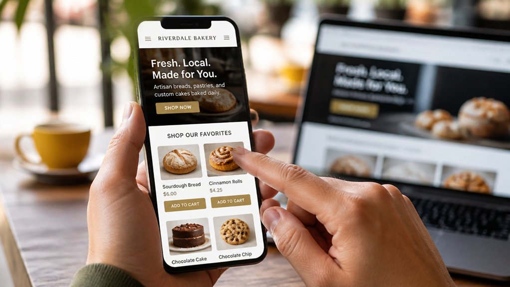
Even if your desktop site looks like a masterpiece, most of your visitors will meet it on a phone—and they’ll judge it in seconds. If your text squints, buttons misfire, or images hog bandwidth, you’re paying for traffic you can’t convert.
Go mobile-first: set base font at 16px+, keep line length readable, and give tap targets breathing room (44px is the common minimum). Compress images, lazy-load below the fold, and ship fewer scripts; every extra second of load time can cost conversions.
Watch Core Web Vitals, especially LCP and INP, because speed is part of your design aesthetics now. Use sticky CTAs sparingly, prioritize thumb-friendly layouts, and test on real devices. Better mobile UX boosts user engagement—and your bottom line.
Clean Up Navigation So Visitors Don’t Get Lost
Because your navigation is the fastest way to say “we’ve got our act together” (or not), you need it to answer one question in under five seconds: where do I click next? If visitors hesitate, they bounce.
Tighten Navigation clarity by limiting your top menu to 5–7 items, using plain labels (no “Solutions Hub”), and keeping your most-requested pages in slot #1–#3. Your menu organization should mirror how customers think, not your org chart.
Group related pages under one dropdown, cap it at 6 links, and avoid mega-menus that read like a novella.
Add a sticky header on mobile, a visible search icon if you have 20+ pages, and consistent CTAs.
Then test with five users; fix what confuses two.
Refresh Your Homepage Value Proposition Fast
Your homepage gets seconds to earn a click, so state your core offer in plain language and skip the “solutions” fog.
Put proof above the fold—numbers, logos, ratings, or one sharp testimonial—because trust beats hype every time.
Then tighten your primary CTA to one clear action and outcome, so visitors don’t scroll like they’re looking for your lost keys.
Clarify Your Core Offer
When a visitor lands on your homepage, you’ve got roughly a few seconds to answer one question: “What do you do for me?” If your value proposition reads like a mission statement or a buzzword buffet, they’ll bounce—fast.
Clarify your core offer in one sharp line: who you help, what you deliver, and the outcome. Use customer segmentation to pick your primary audience first; “everyone” is just “no one” wearing a trench coat.
Then align every headline, button label, and hero image to that promise for branding consistency—no mixed messages, no identity crisis. Keep it concrete: “Bookkeeping for busy contractors” beats “innovative financial solutions.”
Test two versions, watch click-through to your main CTA, and keep the winner. Your homepage isn’t a resume; it’s a decision engine.
Add Proof Above Fold
Even if your headline’s razor-sharp, it won’t land without receipts. Above the fold, you’ve got seconds to prove you’re legit, so show evidence, not adjectives.
Add a tight row of customer testimonials with names, photos, and a specific outcome (“Cut onboarding time 32%”). Pair them with visual storytelling: a before/after graphic, a 15‑second product-in-action clip, or a simple metric badge.
Specific numbers beat “amazing service” every time.
Use credibility shortcuts: recognizable client logos, third-party ratings, and one short case-study stat.
Keep it scannable—three proofs max, big type, zero jargon.
If you can’t quantify yet, quote a concrete moment (“They fixed it same day”).
Your value proposition becomes believable fast, and visitors stop bouncing to “compare options.”
Strengthen Primary Call-To-Action
Although the homepage headline starts the conversation, the primary call-to-action (CTA) closes it—so make it absurdly easy to click “yes.” Pick one main action that matches your #1 business goal (book a call, request a quote, start an order) and write it in plain-English verbs, not vague feel-good buttons like “Learn More.” Put it in a high-contrast button, repeat it once more above the fold, and pair it with a micro-promise that reduces friction (“Get a quote in 2 minutes,” “No credit card”).
Then audit for call to action clarity: can a stranger answer “What happens when I click?” in 3 seconds? If not, you’re donating leads to the internet. For conversion optimization, A/B test verb-first copy, button color, and surrounding reassurance (availability, turnaround, guarantee). One strong CTA beats five weak ones—choice overload kills clicks, not your pricing.
Add Clear Calls to Action on Every Key Page

If your site makes visitors hunt for the next step, you’re quietly donating leads to competitors. Every key page needs an obvious, specific button: Services → “Get a Quote,” About → “Meet Your Team,” Blog → “Subscribe,” Pricing → “Compare Plans,” and location pages → “Call Now.” That’s how you turn curiosity into clicks instead of bounce rates.
Use call to action strategies that match intent: top-of-page for scanners, mid-page after proof, and a final CTA in the footer for late deciders. Keep copy action-led (“Book,” “Download,” “Schedule”), not vague (“Learn More,” aka “Do nothing”).
Apply user engagement techniques like contrast color, whitespace, and short benefit lines to lift CTR. Then A/B test one change at a time; your analytics will tattletale fast.
Fix Contact Forms to Reduce Friction and Spam
When your contact form feels like a tax return, people bail—and when it feels like an open door, bots stroll in. You can fix both with smarter Contact form design: ask only what you’ll actually use (name, email, message), label fields clearly, and show inline errors so users don’t rage-refresh. Keep one required action per line, and make the submit button specific (“Get a Quote,” not “Submit”).
For spam prevention, don’t rely on a single CAPTCHA speed bump. Add honeypot fields, time-to-submit checks, and server-side validation. Rate-limit by IP, block disposable email domains, and send form data through reCAPTCHA v3 or hCaptcha only when risk scores spike.
Track completion rate and spam rate monthly; tweak one variable at a time, like you’re running a tiny lab.
Add Trust Signals: Reviews, Photos, Guarantees
If you want more leads, you’ve gotta earn trust fast—because most visitors decide in seconds whether you’re legit.
Showcase real client photos (not stock) and pair them with reviews, since authentic visuals reduce uncertainty and boost conversion rates.
Then spell out a clear service guarantee in plain language, because “we stand behind our work” beats “trust us” every time.
Showcase Real Client Photos
Why guess what you deliver when you can show it? Swap stock photos for real client images: your team on-site, before-and-after shots, finished installs, smiling customers (with permission). Visitors process visuals faster than text, and authentic photos reduce “Is this legit?” friction instantly.
Pair images with short Client testimonials right under each photo so proof and story land together. Keep your branding visuals consistent: same lighting style, similar framing, and a simple caption template (who, what, where). Add a gallery to key service pages, not a lonely “Photos” tab nobody clicks.
Use filenames and alt text with service + location for SEO. Track clicks to “Request a Quote” after photo sections; let results, not opinions, pick winners.
Highlight Clear Service Guarantees
Real photos and testimonials prove you’ve done the work; clear service guarantees prove you’ll stand behind the next job, too. Put your promise in plain English: what’s covered, for how long, and what you’ll do if something goes sideways.
Specific beats “we care” every time. A simple “On-time or $25 off” or “Fix it free within 30 days” turns hesitation into clicks, because risk drops and conversions rise.
Place guarantees near your “Request a Quote” button, not buried in legalese. Pair them with review snippets that mention reliability and follow-through, and add a quick FAQ to reduce support pings.
Track it: fewer refund disputes, higher close rate, and better customer satisfaction. If you won’t guarantee it, don’t pretend you can.
Upgrade Service Pages With Proof + Pricing
Although your service pages might look polished, they won’t convert like they should until you back them up with proof and make the pricing conversation painless. Use Website analytics to find where visitors bail—then plug those leaks with credibility, not clichés.
Add customer testimonials next to the exact claim they support (“30% faster turnaround”), plus logos, certifications, and before/after examples.
Next, stop making prospects play “guess the invoice.” Offer starting prices, typical ranges, and what’s included at each level. A simple comparison table beats a mysterious “Contact us” nine times out of ten.
Add FAQs that answer cost drivers, timelines, and add-ons, and you’ll pre-handle objections while saving your inbox from repeat questions. Conversions rise; awkward calls drop.
Build Landing Pages for Your Top Offers
Where do your best leads go when they click an ad, scan a QR code, or tap a “Learn more” button—your homepage, the junk drawer of your website? Send them to a landing page built for one job: convert on your top offer.
Strip navigation, sharpen the headline, and match the promise from the ad. Keep visual design clean: one hero image, one primary CTA, plenty of white space, and a mobile-first layout.
Boost user engagement with quick proof (logos, one testimonial, one metric) and frictionless forms (3–5 fields max). Add a bonus nudge: limited spots, a deadline, or a clear next step.
Then A/B test one element at a time—headline or CTA—to lift conversion without guesswork.
Cover SEO Essentials: On-Page, Internal Links, Schema
Landing pages can lift conversions fast, but they won’t help much if nobody finds them in the first place—so you’ve got to tighten up your SEO basics.
Start with keyword research that matches intent: services, locations, and “near me” variants you can actually win.
Then fix on-page fundamentals: clear H1s, scannable sections, image alt text, and fast load times—every extra second can shave conversions.
Build internal links like you’re laying sidewalks: connect blogs to service pages, and service pages to FAQs, so crawlers and humans don’t get lost.
Add schema (LocalBusiness, Service, FAQ) to earn richer results and higher CTR without extra ad spend.
Finally, support it with a backlink strategy focused on local citations and legit industry mentions.
Write Better Title Tags and Meta Descriptions
Because Google often treats your title tag and meta description like the ad copy for your “free” search listing, they deserve more than a shrug and a default template. Treat them like tiny billboards: if they don’t earn the click, your rankings don’t matter.
Write title tags that match intent and read like humans wrote them: primary keyword first, brand last, ~50–60 characters. Use numbers, specifics, and benefits (“Same-Day HVAC Repair | Flat-Rate Pricing”). In meta descriptions (~150–160), answer “Why you?” in one sentence, then add a proof point: years, reviews, warranty, location. This isn’t just SEO; it’s Website branding in miniature. When your snippet promises what the page delivers, you boost user engagement, cut pogo-sticking, and look less like a template factory.
Use a Monthly Website Upgrade Checklist
If you’re not running a monthly website upgrade checklist, you’re basically letting your site freestyle security—and that’s not a strategy. Track patches, plugin updates, backups, and scans on a set schedule so you can spot risks before they become downtime.
Then refresh key pages and SEO basics (content accuracy, internal links, keywords, and CTR) so your rankings don’t slowly leak traffic.
Track Security And Updates
While your homepage might look the same all year, the software behind it changes constantly—and attackers don’t take months off. Put “security and updates” on your monthly checklist and treat it like payroll: non-negotiable.
Start with plugin management—delete what you don’t use, update what you keep, and note versions in a simple log so you can roll back fast.
Next, run firewall monitoring: review blocked requests, unusual IP spikes, and repeated login attempts; patterns beat panic.
Patch your CMS, theme, and server packages within 72 hours of release, because most breaches exploit known flaws.
Rotate admin passwords, confirm backups completed, and test a restore quarterly.
You’re not paranoid—you’re profitable.
Refresh Content And SEO
Next, run quick SEO strategies: check Search Console for queries slipping in position, rewrite the title tag and H1 to match intent, and tighten internal links to your top money pages.
Refresh meta descriptions for higher CTR; a 1% bump can mean dozens more visits without spending a dime.
Finally, prune thin pages or merge them—Google doesn’t reward clutter.
Your website should age like wine, not leftovers.
Conclusion
You don’t need a full redesign to win—just smarter upgrades. Run a quick audit, lock in your baseline metrics, and fix speed and mobile issues first (they hit conversions fast). Streamline navigation so people don’t bounce, then build focused landing pages for your best offers. Nail SEO basics—titles, meta, internal links, schema—so Google can actually read the room. Keep it rolling with a monthly checklist. Why guess when you can measure?
About the Author