
Your growth stalls when your site fails basic clarity, UX, speed, and SEO. If your homepage doesn’t explain what you do in five seconds, people bounce. If navigation has too many choices, users won’t find your main CTA. Slow load times from heavy images and bloated scripts kill mobile conversions. Broken responsive layouts, inconsistent branding, and thin content erode trust. Without clean on-page SEO and GA4 tracking, you can’t fix leaks—next up are the fastest fixes.
Key Takeaways
- Slow load times and poor Core Web Vitals increase bounce rates, especially on mobile, reducing rankings and conversions.
- Broken mobile responsiveness causes overlapping content and hard-to-tap buttons, creating friction that drives users away.
- Unclear homepage value propositions make visitors unsure what you offer within seconds, lowering engagement and lead generation.
- Confusing navigation and missing dominant CTAs prevent users from taking next steps, cutting form fills, calls, and sales.
- Inconsistent branding, outdated design, and thin content reduce trust, making customers hesitate to contact or buy.
Quick Website Audit: Fix the Biggest Mistakes First
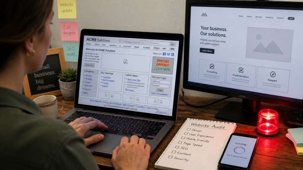
If you don’t run a quick audit first, you’ll waste time polishing pages that are already leaking leads. Start with analytics: check top landing pages, bounce rate, and conversion rate. If a page gets traffic but no sign-ups, it’s a priority fix.
Next, test speed and mobile usability; every extra second of load time lowers User engagement and increases drop-offs.
Then scan your funnel: verify forms submit, thank-you pages load, and tracking fires. Review internal links and navigation paths to ensure visitors reach key pages in two clicks.
Finally, audit Content consistency: headings, offers, and calls-to-action should match across pages so users don’t hesitate. Put issues in a simple scorecard, fix the highest-impact blockers first, and re-measure weekly.
Mistake: Your Homepage Doesn’t Say What You Do
If visitors can’t tell what you do within 5 seconds, they’re gone, so your above-the-fold copy has to state your offer in plain language.
Lead with a strong value proposition—who you help, what you deliver, and the outcome—so the page answers “Why you?” immediately.
Cut vague taglines like “Solutions for your business” and replace them with specific, measurable language that matches what people actually search for.
Clarity Above The Fold
Although your homepage has only a few seconds to earn attention, many small business sites waste that window with vague headlines like “Welcome” or “We deliver excellence.”
Above the fold, you need to state exactly what you do, who it’s for, and where you do it—so visitors can instantly decide they’re in the right place.
Audit your first screen like a stopwatch test: can someone answer “What is this?” in five seconds? If not, you’re forcing extra clicks and increasing bounce risk.
Use visual hierarchy to make the primary statement the largest element, supported by a short clarifier and a single, obvious next step.
Keep font consistency so visitors don’t mistake style changes for separate sections.
Remove sliders, competing badges, and generic stock images that dilute meaning.
Clarity beats cleverness every time.
Use A Strong Value Proposition
Because most visitors skim before they commit, your homepage needs a value proposition that states—in plain language—the result you deliver, for whom, and why you’re a better choice than the next tab. If you don’t say it fast, users bounce, and bounce rate climbs while leads drop.
Treat your homepage like a conversion asset: name the customer, name the problem, name the measurable outcome. Then support it with proof—numbers, timeframes, guarantees, or recognizable clients—so you’re not asking for blind trust.
Your Unique value should be obvious within five seconds: what you do, who it’s for, and the payoff. Build a clear Differentiation strategy by highlighting one constraint you remove (speed, risk, complexity, cost) and the method that makes it repeatable.
Avoid Vague Taglines
When your homepage leads with a tagline like “Innovative Solutions” or “We Care About Quality,” you force visitors to guess what you actually sell, and most won’t. Vague Taglines increase cognitive load and slow decision-making; online, seconds matter.
If people can’t confirm fit immediately, they hit back, and your bounce rate climbs. You don’t need clever—you need specific. State what you do, who it’s for, and the outcome: “Bookkeeping for local contractors” beats “Trusted Partner” every time.
Tight Brand Messaging also improves ad relevance and SEO because your page aligns with the words customers actually search. Audit your hero section: can a stranger name your service in five seconds? If not, rewrite it and test it.
Mistake: Navigation Makes People Work Too Hard
If your navigation makes visitors think, you’re leaking conversions—users scan fast and bounce when they can’t find what they need in seconds.
Too many menu items, confusing labels and structure, and buried key links force extra clicks and guesswork, which increases drop-offs on every step.
You need a tight, predictable menu that matches how customers search, puts top pages in plain language, and keeps critical links visible.
Too Many Menu Items
Although a mega-menu can look “complete,” too many top-level items usually hurts performance: it forces visitors to scan, compare, and second-guess instead of clicking. Each extra option adds cognitive load and slows decisions, which can raise bounce rates and depress conversions.
If you see Menu clutter, you’re not offering choice—you’re taxing attention. Aim for Navigation simplicity: keep primary navigation to 5–7 core destinations that match your highest-intent user paths. Push secondary pages into a single “More” or “Resources” drop-down, and surface key actions (Call, Book, Buy, Get a Quote) as distinct buttons.
Then validate with analytics: compare click-through from the header, time to first click, and conversion rate before and after you cut items.
Confusing Labels And Structure
Even with a clean-looking header, confusing labels and a messy page hierarchy make your navigation do the opposite of its job: reduce effort. If users can’t predict what they’ll get after a click, they hesitate, backtrack, or bounce.
Analytics typically shows this as higher exit rates from top-level pages and more pogo-sticking between sections. You fix it by prioritizing label clarity: use plain, specific terms customers already search for, not internal jargon like “Solutions” or “Resources.”
Then tighten structure hierarchy so pages ladder logically from broad to narrow, with consistent naming patterns across categories. Run a quick tree test or first-click test; if people can’t find core tasks fast, your navigation’s costing you leads daily.
Hidden Key Page Links
When you bury high-intent pages—pricing, services, booking, contact, FAQs—behind dropdowns, footers, or vague “Learn More” buttons, you force visitors to hunt instead of decide. That extra effort shows up as exits, not leads. Users scan, they don’t explore; if your next step isn’t visible within seconds, they bounce to a competitor.
Audit your top navigation against your data: which pages drive conversions, calls, and form starts? Promote those links to the primary menu and above the fold. Reduce Hidden links by limiting dropdown depth to one level and using clear, task-based labels.
Fix your page hierarchy so your money pages sit closest to the home page, not three clicks away. Fewer clicks equals more completed actions, faster.
Mistake: Slow Pages Make Visitors Bounce

If your site takes more than a couple seconds to load, you’re not “just a bit slow”—you’re actively pushing potential customers out the door. Page speed is a conversion lever, not a technical necessity.
When pages lag, people abandon tasks, skip forms, and stop scrolling, which cuts User engagement and signals low quality to search engines.
You can’t fix what you don’t measure. Check Core Web Vitals, time to first byte, and total blocking time, then prioritize the biggest offenders.
Compress and properly size images, defer noncritical scripts, remove bloated plugins, and enable caching.
Use a CDN if you serve customers across regions.
Every saved second reduces friction, increases session depth, and makes your site feel trustworthy.
Mistake: Mobile Layout Breaks the Experience
If your mobile layout breaks, you’re bleeding customers where most sessions now happen: on phones. Broken responsive grids force zooming and sideways scrolling, and tap targets that are too small drive misclicks and abandoned forms.
Even when the design looks fine, slow mobile load times erase conversions because users won’t wait.
Broken Responsive Grids
Although your site may look polished on a desktop, a broken responsive grid can turn the mobile experience into a mess—overlapping text, cropped images, and buttons that drift off-screen. When your Responsive grids fail, users can’t scan offers, compare services, or finish a checkout without friction.
That shows up in analytics fast: higher bounce rates, shorter sessions, and fewer conversions from mobile traffic that often exceeds 50% for small businesses.
You fix this by testing real breakpoints, not just “shrinking” the browser. Audit common widths (320, 375, 414, 768) and watch for columns that don’t reflow, fixed-width elements, and rogue margins.
Improve grid responsiveness with fluid units, consistent container widths, and CSS grid/flex rules that wrap predictably. Monitor after every template change too.
Tap Targets Too Small
When tap targets run too small on mobile, you force users into precision taps they can’t reliably execute on a thumb-driven screen. That friction isn’t subtle: small links, cramped checkboxes, and tight menu icons raise mis-taps, backtracks, and abandonment, especially on forms and checkout.
Design to measurable thresholds. Aim for tap areas around 44–48px and keep at least 8px spacing so adjacent actions don’t compete. Use visual hierarchy to separate primary actions from secondary links, and don’t hide critical buttons in dense toolbars.
Your color schemes should reinforce intent—high-contrast buttons for “Buy,” muted tones for “Learn more”—so users don’t guess. Also guarantee focus states and error messages don’t overlap controls. If it takes two tries, you’re leaking conversions.
Slow Mobile Load Times
Big tap targets won’t save you if your mobile pages take forever to load. When load speed drags, users don’t “browse”; they bounce. Mobile networks fluctuate, so heavy images, bloated scripts, and multiple trackers punish you fast.
If your layout shifts while assets load, taps misfire and the experience breaks—especially on product pages and forms.
Treat Mobile optimization like revenue protection. Compress and resize images, defer noncritical JavaScript, and remove plugins you don’t need. Use caching, a CDN, and modern formats like WebP.
Audit Core Web Vitals and watch Largest Contentful Paint and Total Blocking Time; they correlate with drop-offs. You can’t out-market a slow site, and you shouldn’t try. Fix performance, then design wins.
Mistake: No Clear Call-to-Action on Key Pages
Even if your pages attract steady traffic, you’ll waste a large share of that attention if visitors can’t spot the next step in seconds. When your homepage, service pages, or blog posts lack a dominant CTA, you force people to guess, and most won’t.
Analytics usually shows it: high time-on-page with low click-through, or strong sessions but weak lead events. Fix it with tight call to action strategies: one primary goal per page, one contrasting button above the fold, and supporting copy that states value and timeframe.
Keep labels action-first (“Get a quote,” “Book a demo”), not vague (“Learn more”). Then measure user engagement via CTA CTR, scroll depth, and funnel drop-offs, and iterate weekly.
Mistake: Your Contact Page Is Missing Essentials

Although your contact page looks simple, it often decides whether a ready-to-buy visitor turns into a lead. When it lacks contact details and other essential information, you force people to hunt, hesitate, and bounce.
You should list a phone number, monitored email, physical address (or service area), and hours—then keep them consistent with your header, footer, Google Business Profile, and directories. In local search studies, incomplete NAP data (name, address, phone) correlates with weaker map visibility and fewer calls.
Add a clear “how to reach you” hierarchy: fastest channel first, then alternatives. Include response-time expectations and a dedicated support or sales line if you have one. If you operate by appointment, say it plainly.
Remove dead links and outdated addresses too.
Mistake: Forms Fail or Feel Too Complicated
When your forms break, load slowly, or ask for too much, you turn high-intent visitors into drop-offs. Every extra field adds Form complexity and increases user frustration, especially on mobile. If your form throws validation errors late, wipes entries, or hides required fields, you’re effectively raising the cost of contacting you.
Audit your forms like a funnel: view-to-start rate, start-to-submit rate, error rate, and time-to-complete. If starts are high but submissions lag, your friction is inside the form.
Cut fields to the minimum, use clear labels, show errors inline, and keep formatting flexible for phone numbers and addresses. Add autofill, fast loading, and a simple confirmation message.
Then A/B test shorter vs longer forms weekly.
Mistake: Outdated Design Signals “Not Trustworthy
Fixing form friction gets people to click “Submit,” but your site’s design determines whether they trust you enough to start. If your layout looks like it hasn’t been updated in years—tiny fonts, dated icons, stock photos, cluttered sidebars—visitors assume your business runs the same way. That perception shows up in behavior: higher bounce rates, shorter sessions, and fewer quote requests.
Run a quick audit: does your site feel modern on mobile, load fast, and use clear hierarchy? Strong Visual storytelling helps people grasp what you do in seconds, while Brand consistency in typography, spacing, and imagery signals operational discipline.
Update templates, simplify navigation, refresh photography, and tighten contrast. You don’t need flashy; you need current, readable, and credible.
Mistake: Branding Changes From Page to Page
Even if your logo stays the same, inconsistent branding from page to page—different fonts, button styles, colors, photo treatments, or tone—signals chaos, not credibility. Visitors make trust judgments fast, and when each click feels like a new company, you raise friction and drop conversions.
Brand consistency isn’t “nice to have”; it’s a performance lever. If your homepage uses clean typography and muted colors but your service pages switch to neon accents and mismatched icons, your brain forces users to re-learn the interface. That cognitive load increases bounce and reduces form completions.
Audit your templates: one type scale, one button system, one color palette, one imagery style. Lock them into a design system so every page reinforces visual harmony and recognition.
Mistake: Thin Content Doesn’t Answer Buyer Questions
Consistent branding gets you the first click; content that answers real buyer questions gets you the lead. If your pages stay high-level, you force prospects to keep shopping. Thin content skips the proof points: pricing ranges, timelines, comparisons, use cases, risks, and what “success” looks like. That gap kills trust and conversion.
Treat every service page like Buyer education, not a brochure. Map FAQs to the buyer journey: problem, options, selection criteria, and next steps. Add Content depth with specifics—process steps, deliverables, constraints, measurable outcomes, and who it’s for/not for.
Use data where you can: typical turnaround, ranges from past projects, and common failure modes. When you answer hard questions upfront, you filter out bad-fit leads and speed up good-fit decisions.
Mistake: Basic On-Page SEO Isn’t Set Up
If you haven’t set up basic on-page SEO, you’re making it harder for Google to understand what you do, who you serve, and which searches your pages should win. When your title tags, H1s, and meta descriptions don’t map to real queries, you’ll rank inconsistently and miss high-intent traffic.
Start with Keyword research: identify the terms buyers use, then assign one primary keyword per page.
Align your URL, title tag, H1, first paragraph, and image alt text to that intent—without stuffing. Use internal links to connect related services and FAQs so crawlers and users follow a clear path.
Your Content strategy should define which pages target awareness vs. conversion, and ensure each page answers one job-to-be-done quickly.
Mistake: No Analytics Means You Can’t Improve
Strong on-page SEO helps you earn clicks, but analytics tells you what those clicks actually do on your site. If you’re not tracking sessions, sources, and conversions, you’re guessing why leads stall. You can’t see which pages leak visitors, which CTAs get ignored, or whether your contact form fails on mobile.
Install GA4 or a privacy-first alternative, then define events: call clicks, form submits, quote requests, checkout starts. Tie those to UTM-tagged campaigns so social media integration isn’t a black box. Review funnels weekly, not yearly, and run one change at a time so results are attributable.
Respect Data privacy with consent banners, IP anonymization, and retention limits. When you measure, you prioritize fixes that move revenue, not opinions.
Conclusion
It’s ironic: you built a website to grow, yet a few avoidable mistakes quietly shrink results. If your homepage is vague, navigation’s clunky, or pages load in 4+ seconds, you’re paying to lose attention. If mobile breaks, branding shifts, content stays thin, SEO’s missing, and analytics aren’t running, you can’t fix what you can’t measure. Run the quick audit, patch the leaks, then watch conversions rise for the same traffic.
About the Author