
Turn your small business website into a sales tool by guiding every visitor to one clear next step—book, buy, or get a quote—and cutting competing links. Write a homepage headline under 12 words that promises an outcome, then place a specific CTA above the fold. Add proof near that CTA: testimonials with names, results, and 3–5 trust badges. Shrink forms to essentials, speed up mobile, and track key events in GA4. Keep going to see how to test and recover more sales.
Key Takeaways
- Structure pages like a funnel: clear promise first, proof next, and a single “next step” CTA to guide every visitor.
- Simplify navigation to reduce choices: keep only core pages, move secondary links to the footer, and prioritize high-margin offers.
- Optimize homepage and landing pages with a 12-word outcome headline, above-fold CTA, and matching message to each traffic source.
- Build trust near CTAs using specific testimonials, measurable proof, and 3–5 selective trust badges like guarantees or verified reviews.
- Track and improve conversions by reducing form fields, speeding up mobile pages, and measuring key events in GA4 via Google Tag Manager.
Map Your Website to One Clear Next Step

If your website gives visitors too many choices, they’ll often choose none. Pick one primary action per page—book a call, request a quote, or buy—and make every element support it.
Analytics routinely show that fewer competing links increase conversions; treat your navigation like a funnel, not a sitemap.
Map the customer journey from first visit to purchase and label each page with its “next step.” Then build a clear content hierarchy: lead with the promise, follow with proof (pricing, benefits, FAQs), and end with a single CTA repeated consistently.
Move secondary options (blog, careers, social) to the footer or a slim utility menu. Finally, check every page: if a section doesn’t move users forward, cut it or relocate it.
Write a Homepage Headline That Sells in 5 Seconds
Although visitors may scroll, they decide whether to stay within seconds, so your homepage headline has to communicate your offer at a glance.
Aim for a clear value proposition: what you do, who it’s for, and the result you deliver. Keep it under 12 words, use plain language, and lead with outcomes (“Cut bookkeeping time in half”) instead of features.
Test readability: if a stranger can repeat it after one glance, it works.
Support it with a short subhead that adds proof points, constraints, or differentiators (location, niche, turnaround time).
Maintain branding consistency by matching tone and vocabulary to your ads, emails, and signage.
Follow content hierarchy: headline first, subhead second, supporting bullets last, so scanning eyes catch meaning fast.
Remove jargon, vague claims, and “welcome” filler.
Add One Primary CTA Above the Fold
Where do you want a new visitor to click first? Put that single action in a primary button above the fold, next to your headline, so it’s visible without scrolling. Sites that present one clear choice reduce decision friction and lift conversions versus multiple competing CTAs.
Use content hierarchy: headline states the outcome, subhead supports it, then one CTA tells them what to do.
Keep the button label specific (“Get a Quote,” “Book a Call,” “Start Trial”), not vague (“Submit”).
Maintain branding consistency by using one accent color for the primary CTA and reserving neutrals for secondary links.
Add a short trust cue nearby (rating, years, guarantee) to increase clicks without adding more options.
Build Landing Pages That Match Each Traffic Source
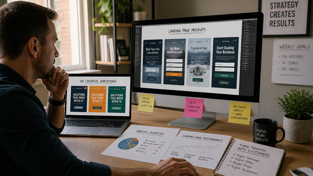
Because each channel brings visitors with a different intent and promise, you’ll convert more of that traffic when the landing page mirrors the exact ad, email, or search query that sent them. Don’t dump everyone on your homepage; use traffic segmentation to route paid search, social, referrals, and email to pages built for that context.
Match headline and hero copy to the source message, keep the offer identical, and pre-answer the top objection for that segment. Use audience targeting to swap benefits, images, and FAQs by industry, location, or lifecycle stage.
Keep the form fields aligned to intent: colder traffic gets fewer fields; warmer traffic can handle more.
Track source-level conversion rate, bounce rate, and scroll depth. If one channel underperforms, iterate the page—not the budget.
Earn Trust Fast With Reviews, Badges, and Proof
When you have just a few seconds to convince a new visitor, you need proof—not promises—to earn their confidence and keep them moving toward a purchase. Put Customer testimonials where doubt spikes: next to pricing, quotes, and your primary CTA. Use full names, photos, and specific outcomes (time saved, dollars earned) to raise credibility.
Add Trust badges that reduce perceived risk: payment security, SSL, money-back guarantee, and “verified reviews.” Don’t overdo it—3–5 relevant badges beat a cluttered footer. Show real proof with numbers: average rating, review count, and “last updated” dates so visitors know it’s current.
If you’re B2B, add logos and a short case snapshot. Track lift: A/B test pages with vs. without proof blocks and watch conversion rate changes.
Make Your Website Navigation Friction-Free
If visitors can’t find what they need in a few seconds, they’ll bounce and you’ll lose sales. Keep your menu structure simple—stick to the core pages, use clear labels, and cap top-level options so every click moves people closer to a quote, call, or checkout.
Then optimize mobile navigation with a thumb-friendly menu, readable tap targets, and a persistent CTA so your highest-intent traffic converts on small screens.
Simplify Menu Structure
Design your user flow around revenue actions. Put your highest-margin offer and primary CTA in the first or second position, not buried under drop-downs. Use one level of dropdowns max; deeper nesting drops discovery and increases exits.
Group pages by decision stage: Learn, Compare, Buy, Support.
Audit every menu link: if it doesn’t answer a common question or drive a sale, remove it.
Optimize Mobile Navigation
Because more than half of your traffic likely comes from phones, clunky mobile navigation quietly kills conversions before users even see your offer. If your menu takes more than two taps to reach a key page, you’re leaking leads.
Use responsive design so buttons stay thumb-sized (44px+), text stays readable, and tap targets don’t overlap. Put your top actions—Call, Book, Buy, Get Quote—above the fold and sticky. Add gesture based navigation sparingly: swipeable galleries and back gestures help, but don’t hide critical links behind undocumented swipes.
Keep the hamburger menu short, label it “Menu,” and include a visible search icon for catalogs. Test on real devices, not just emulators, and watch session recordings to spot rage taps.
Speed Up Your Website to Stop Losing Buyers
While you’re polishing copy and tweaking offers, a slow website can quietly drain sales—page-load delays of even 1–3 seconds increase bounce rates and cut conversions. Treat speed like revenue protection: measure Core Web Vitals, then fix the biggest bottlenecks first.
Compress and serve next-gen images (WebP/AVIF), lazy-load below-the-fold media, and remove unused scripts. Enable caching, minify CSS/JS, and use a CDN to cut latency for every visitor.
Upgrade hosting if your TTFB is high, and reduce third-party tags that stall rendering. Pair content optimization with stricter website security: keep plugins updated, block malicious traffic, and add a WAF so attacks don’t slow pages.
Re-test after each change and track conversion lift over time.
Cut Form Fields and Simplify Checkout or Booking

Even if your offer is strong, every extra field in a form or step in checkout creates friction that kills conversions. Most small-business sites ask for too much too soon. Aim for Form reduction: keep only what you need to fulfill the order or confirm the booking—name, email, and one qualifier.
Move “nice-to-have” details to a follow-up email or intake call.
Apply checkout streamlining by removing account creation, collapsing address lines, auto-filling city/state, and showing fees and delivery dates upfront. Add guest checkout, one-click payment options, and a single-page flow where possible.
Use clear inline validation so users fix errors instantly, not after submission. If you run bookings, default to the next available slot, reduce choices, and confirm in one tap.
Cut steps, and you’ll raise completion rates.
Track Website Conversions With GA4 and Key Events
You can’t improve what you don’t measure, so define your conversion key events in GA4 (form submits, calls, bookings, purchases) and treat them as your sales scoreboard.
Next, configure GA4 event tracking so every high-intent action is captured consistently across pages and devices.
Then use Conversion Path reports to see which channels and steps drive wins—or where prospects drop off—so you can fix the leaks fast.
Define Conversion Key Events
Before you can improve conversions, you’ve got to define what a “conversion” actually means on your site and then track it consistently.
List the outcomes that directly support revenue: form submissions, calls, demo bookings, checkout completions, and email signups tied to follow-up.
Map each one to the customer journey so you know which step you’re measuring—discovery, consideration, or purchase.
Keep your list short: 3–7 key events beats 30 noisy actions.
Use engagement metrics (like time on page, scroll depth, or repeat visits) as supporting signals, not primary conversions, unless they reliably predict sales.
Write a one-line definition for every key event, including who qualifies and what counts as success.
Then review monthly and refine based on actual lead quality.
Configure GA4 Event Tracking
Once you’ve defined your key events, set them up in GA4 so every form submit, call click, and booking request gets recorded the same way across the site.
Use Google Tag Manager to fire events on clear triggers (submit, tel: click, calendar confirmation).
Standardize names and parameters (event_name, page_location, form_id, value) so reporting stays clean.
Mark the right events as Key events in GA4 Admin and test in DebugView before you publish.
Add safeguards for Data privacy: avoid sending names, emails, or message content, and enable consent mode if required.
Measure user engagement by attaching context like button_text and lead_type, not personal data.
Finally, validate totals against your CRM or call-tracking logs weekly to catch gaps early.
Analyze Conversion Path Reports
After GA4 records your Key events consistently, Conversion Path reports show the real sequence of touchpoints that drives leads—organic search, paid clicks, email, direct visits, and referrals—so you can stop guessing which channels “work.”
Open Advertising > Attribution > Conversion paths, pick your lead Key event, and set a 30–90 day lookback to match your sales cycle. Then sort by conversions and conversion value to find the top paths.
If paid search appears early but rarely last, tighten landing pages and add retargeting email capture.
If direct dominates the last touch, you’ve got a brand or attribution gap—tag every campaign link.
Use path length and time lag to map the customer journey and run funnel analysis: cut steps, remove friction, and reallocate budget to the touchpoints that close.
Capture Emails On-Site to Recover Lost Sales
Even if a visitor leaves without buying, you can still turn that session into future revenue by capturing their email on-site. Add an Email capture offer that matches intent: a first-order discount, back-in-stock alerts, or a quick “send me the quote” option. Place it on high-exit pages and cart/checkout, where abandonment is highest.
Keep friction low: ask for email only, explain the benefit in one line, and confirm instantly. Then trigger a simple recovery sequence within 1 hour: reminder, value proof, and a clear link back to the saved cart or product page.
Track sign-up rate, open rate, and revenue per subscriber so you can quantify sales recovery and stop guessing. Integrate with your CRM for attribution accuracy.
A/B Test Headlines, CTAs, and Forms First
Because small copy changes can swing conversions fast, you should A/B test your headlines, CTAs, and forms before you redesign anything.
Start with headline testing on your top landing pages: run two variants for at least 500 visits each, and track click-through to the next step, not just time on page.
Next, focus on CTA optimization: test one variable at a time (button text, color, placement), and judge success by completed leads or purchases.
Then simplify forms: remove nonessential fields, add inline error messages, and test single-step versus multi-step.
Use your analytics to segment by device; mobile often reacts differently.
Ship the winner, document what changed, and stack small wins into measurable revenue.
Conclusion
Picture your website like a well-lit storefront: you’re guiding visitors down one clear aisle to one next step. In 5 seconds, your headline should tell them what you do and why it matters, then your primary CTA sits above the fold like a bright “Open” sign. You back it with reviews and proof, cut friction in forms and checkout, and track key events in GA4. Then you test, tweak, and watch conversions climb.
About the Author