
You’ll get results when you pick one measurable goal—calls, bookings, or sales—and build every page to drive that action. Choose a builder you can maintain, then map a simple path like Home → Service → Proof → Contact, with a clear CTA above the fold and repeated after key sections. Write scannable copy that says what you do, who it’s for, and the next step. Keep load time under 3 seconds, nail titles/URLs/internal links, and optimize your Google Business Profile. Keep going to see the exact steps and tracking setup.
Key Takeaways
- Set one primary goal (calls, bookings, or sales) and align pages, CTAs, and tracking metrics to it.
- Structure navigation around a simple conversion path, with dedicated service pages, trust proof, and “Contact” always visible.
- Use clear, scannable copy that states what you do, who it’s for, and the next step, using customer language and specifics.
- Make CTAs obvious and mobile-first: one primary action above the fold, repeated after key sections, with 44px tap targets.
- Optimize speed and SEO: load under 3 seconds, compress images, reduce scripts, and use keyword-focused titles, URLs, and local signals.
Pick One Website Goal: Calls, Bookings, or Sales
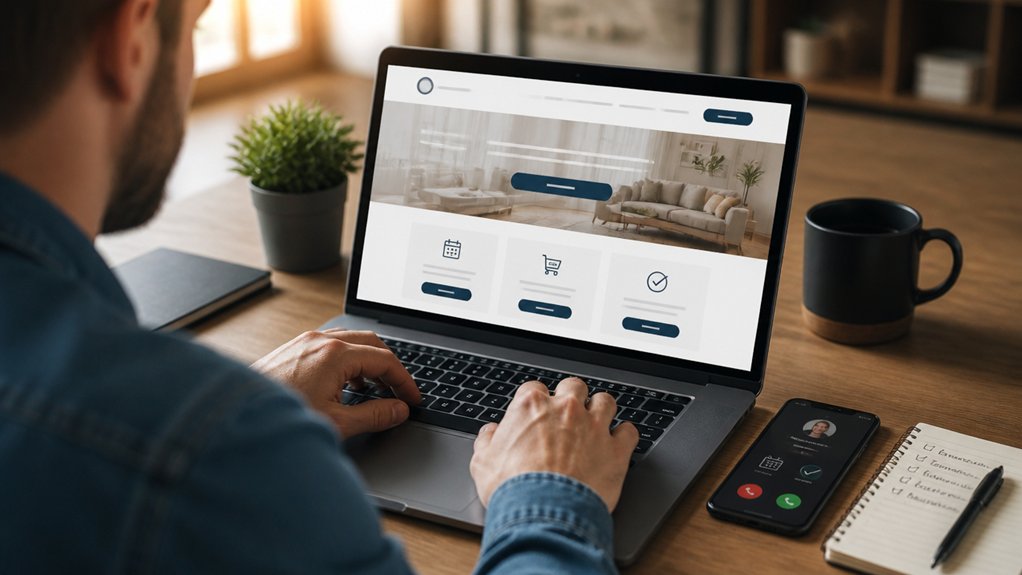
Before you pick a theme or write a single page, decide what your website’s primary job is: drive calls, capture bookings, or generate sales. When you commit to one goal, you can measure it, improve it, and stop guessing.
If you need calls, put a click-to-call button above the fold, keep forms short, and track call volume and qualified leads.
If you need bookings, show real-time availability, reduce steps to confirm, and monitor completion rate.
If you need sales, streamline checkout, highlight guarantees, and track conversion rate and average order value.
One goal sharpens Customer engagement because every page supports one action.
It also enforces branding consistency, since your messaging, visuals, and offers stay aligned from landing page to follow-up.
Choose a Builder That Fits Your Budget and Skills
Choose a website builder that matches your skill level, because a tool you can’t update will cost you time and lost leads.
Compare platforms by total cost—not just the monthly plan—by pricing themes, apps, transaction fees, email, and any developer help you’ll need.
When the tool and the true price fit your budget, you’ll ship faster and keep control of your site.
Match Tools To Skill
If you match your website builder to your actual skills and budget, you’ll launch faster and spend less cleaning up mistakes. Start with a quick skill assessment: can you edit layouts confidently, handle basic SEO settings, and troubleshoot plugins, or do you want guided, drag-and-drop workflows? Your answers determine the right matching tools.
If you’re non-technical, pick a builder with templates, built-in hosting, and form/booking blocks so you can publish in hours, not weeks.
If you can code lightly, choose a platform that lets you add custom CSS and integrates cleanly with your email and analytics.
If you manage multiple pages or products, prioritize bulk editing, roles, and a solid editor history.
Test-drive two builders for 30 minutes each.
Compare Total Platform Costs
Three numbers tell you the real price of any website platform: the monthly plan, the add-ons you’ll inevitably need (domain, email, bookings/ecommerce, SEO tools), and the time cost of setup and fixes.
Do a quick cost comparison on a 12-month sheet, not a checkout page. Add your domain ($10–$20/yr), email ($6–$15/user/mo), and any paid apps. If you sell, include payment fees and shipping/tax tools. If you book, price scheduling and reminders.
Then score Platform integration: can it connect to your CRM, POS, and accounting without manual exports? Every workaround adds hours.
Finally, price your time: even 3 hours/month at $50/hr is $1,800/year.
Pick the platform that keeps totals low and workflows simple.
Map a Site Structure That Gets Leads
Before you design pages or pick a theme, map a site structure that guides visitors from first click to contact without friction. Start with your top conversion paths: Home → Service → Proof → Contact, plus a short FAQ.
Keep site navigation to 5–7 primary items; more choices drop completion rates and customer engagement. Put “Contact” and one primary offer in the header, and repeat a single call to action in the footer.
Build one page per core service, each linked from Home and a Services hub, so users never hit dead ends.
Add trust nodes—Reviews, Case Studies, About—within one click of service pages.
Use analytics to validate flow: track clicks to Contact, form starts, and drop-offs, then simplify.
Write Copy Your Customers Actually Read
Because web visitors skim, not study, your copy has to earn attention fast and push people to the next step. Lead with the outcome you deliver, not your origin story.
Use short sentences, specific numbers, and plain language: pricing ranges, turnaround times, service areas, and what’s included. Replace vague claims (“high quality”) with proof (“4.8-star average from 312 reviews”).
Write for one reader: the customer who’s comparing options. Mirror their words from calls, reviews, and search queries to boost relevance and customer engagement.
Keep paragraphs under three lines, use scannable subheads, and cut every extra adjective.
Save brand storytelling for moments that explain why your approach reduces risk or improves results.
End sections with one clear action: call, book, request a quote.
Build a Homepage That Answers 3 Questions Fast
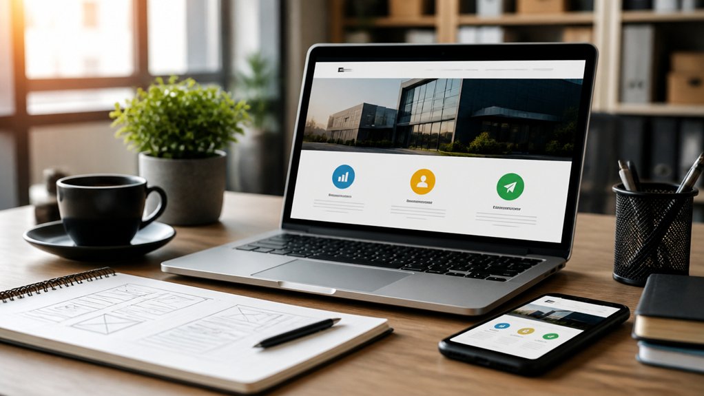
When someone lands on your homepage, you’ve got seconds to prove they’re in the right place. So answer three questions immediately: What do you do, who’s it for, and how do they take the next step.
Put your one-sentence value proposition above the fold, written in plain language, not jargon. Follow with a tight line that names your ideal customer and the problem you solve.
Then add one primary call-to-action button (book, call, get a quote) and repeat it once more down the page.
Use visual branding to reinforce trust fast: consistent colors, readable type, real photos, and a clean layout.
Let your content strategy drive the order—most important info first—so skimmers get it in one pass.
Test headlines and CTAs, and track clicks.
Create Service Pages With Pricing, Proof, and Next Steps
Although your homepage wins the click, your service pages win the conversion, so build each one to answer the buyer’s practical questions in order: what’s included, what it costs (or the range and what drives it), why you’re credible (results, reviews, case snapshots), and exactly what to do next.
List deliverables and timelines in bullets, then show pricing strategies: tiered packages, a “starting at” rate, or a range tied to scope, speed, and complexity.
Add proof where it matters: 2–3 quantified outcomes and short customer testimonials placed beside the matching service.
Close with one clear next step: “Book a 15‑minute call,” “Request a quote,” or “Choose Package A,” plus what happens after they click and your response time.
Keep the page skimmable, not salesy.
Add Trust Signals That Reduce Buyer Doubt
Even if your service page explains everything clearly, most buyers still look for signals that you’re legit before they hand over money or time. Add friction-reducers where decisions happen: headers, pricing sections, and checkout/contact points.
Start with brand consistency: keep your logo, colors, tone, and business name identical across every page and footer. Mismatches feel risky and can spike abandonment.
Show concrete credentials: licenses, insurance, certifications, memberships, and “as seen in” logos, but only if they’re verifiable. Use trust badges sparingly—SSL/secure payment, privacy, and guarantees—near forms and payment buttons, not buried on an About page.
Make contact details easy: phone, email, address, and hours. Add a plain-language privacy note under forms.
Finally, use fast load times and HTTPS sitewide; slow, insecure pages bleed leads.
Use Reviews and Testimonials Where They Matter Most
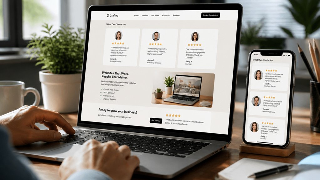
Because most visitors skim first and decide fast, you’ll get more booked calls and checkout completions by placing reviews and testimonials right next to the actions you want them to take—under the primary CTA, beside pricing, and near contact or payment forms—rather than hiding them on a separate “Testimonials” page.
Put the most specific proof closest to the highest-friction moments: “on time,” “fixed in one visit,” “saved $400,” or “answered same day.” Pull fresh Customer feedback from Google, industry sites, or post-job surveys, and show the source and date to boost credibility.
Use 2–3 short quotes per page, then link out for more. Watch your Online reputation like a KPI: respond to negatives, highlight patterns, and swap in newer reviews to stay relevant.
Make Your CTAs Obvious: Call, Book, Quote, Buy
When a visitor’s ready to act, your website should make the next step impossible to miss: call, book, request a quote, or buy. Put one primary CTA above the fold and repeat it after key sections, so you’re not forcing extra scrolling or guesswork.
Use clear verbs (“Call Now,” “Book a Time,” “Get a Quote,” “Buy Online”) and keep each button tied to one outcome.
Build visual hierarchy with size, placement, and whitespace: the main CTA should be the most dominant element on the page.
Apply color psychology intentionally—use a high-contrast, brand-aligned color for the primary button and reserve it only for actions.
Track clicks, calls, and form starts; if engagement’s low, simplify the choice and tighten the copy.
Design Mobile-First for Thumbs, Not Desktops
While desktop layouts still matter, most small-business traffic now comes from phones, so you should design for thumbs first and screens second. Put your primary actions in the lower third where hands naturally reach; that’s thumb navigation that converts. Keep your menu short, labels clear, and tap targets at least 44px so mis-taps don’t cost you leads.
Use a sticky bottom bar for Call, Book, or Quote when it matches your funnel. Prioritize one column, readable type, and high-contrast buttons. Test in both portrait and landscape screen orientation, because forms and maps behave differently.
Don’t hide key info behind tiny icons; people scan fast. Run quick usability checks on real devices, not just browser previews.
Speed Up Load Time to Stop Losing Leads
How fast does your site load on a normal 4G connection? If it’s over 3 seconds, you’re bleeding leads. Buyers bounce when pages stall, and every extra second drags conversion rates down. Run a quick test on your top landing pages, then fix the biggest bottlenecks first.
Start with Page load optimization: compress and resize images, lazy-load below-the-fold media, minify CSS/JS, and remove unused scripts and plugins. Use caching and a CDN so repeat visitors and distant users don’t wait.
Next, target server response time: upgrade cheap hosting, enable HTTP/2 or HTTP/3, and keep database queries lean. Track Core Web Vitals weekly and treat speed like a sales metric, not a tech chore.
Cover the SEO Basics: Titles, URLs, Internal Links
A fast site keeps visitors from bouncing, but SEO determines whether they find you in the first place. Start with Keyword research: pick one primary phrase per page based on search volume and intent, then use it in your title tag and H1.
Keep titles under ~60 characters so they don’t truncate in results, and lead with the value (“Emergency Plumbing in Austin” beats “Home”). Write Meta descriptions (around 150–160 characters) that match the page and include a clear benefit and next step.
Use short, readable URLs: /services/drain-cleaning, not /page?id=123. Build internal links that connect related pages using descriptive anchor text, so Google and users can navigate fast and understand your site structure.
Get Found Locally With Google Business Profile
To show up in local results and on Google Maps, you’ve got to claim and verify your Google Business Profile listing.
Then you should optimize the details that drive local search—accurate NAP, categories, services, hours, photos, and reviews—so Google can match you to nearby intent.
Finally, you can post updates and time-bound offers to keep your profile active and give searchers a clear reason to choose you now.
Claim And Verify Listing
Where do nearby customers look first when they need a service today? Often, they search Google and scan the map pack. If you haven’t completed Profile claiming, you’re leaving that high-intent traffic to competitors.
Start by claiming your Google Business Profile and confirming you control it. Then complete Listing verification using Google’s method (postcard, phone, email, or video), and keep records of the account owner, login, and recovery options.
Verified listings are far less likely to be edited by others and more likely to show for branded searches. You’ll also unlock management features like messaging, updates, and insights—tools that help you measure calls, direction requests, and website clicks.
Do this before you promote your website, so every local visit lands on a profile you own.
Optimize Local Search Details
Once your Google Business Profile is claimed and verified, the next step is making it rank for the searches that actually bring in calls. Start with Keyword research: list your top services plus “near me” and neighborhood terms, then map the best phrases into your primary category, additional categories, and business description without stuffing.
Add every service, product, and attribute you actually offer, because filters drive clicks.
Lock in your NAP (name, address, phone) and hours, then match them on your website and across Local citations like Yelp, Apple Maps, Bing Places, and industry directories. Inconsistent listings confuse Google and cut visibility.
Upload sharp photos with descriptive filenames, pick a service area you truly cover, and add appointment or quote links so searchers convert fast.
Post Updates And Offers
How do you stay visible in local results after you’ve nailed your categories and NAP? Use Google Business Profile Posts to signal freshness. Google favors active listings, and frequent updates can lift calls and direction requests.
Publish one update weekly: a new product, seasonal service, or a quick tip. Add a clear CTA like “Call now” or “Book,” plus a UTM-tagged link so you can measure clicks in Analytics.
Run Offers Posts for promotions: include price, start/end dates, and terms to reduce wasted leads. Reuse the same creative in Social media and in Email campaigns so customers see it twice.
Track what converts: views, actions, calls, and website visits. Then repeat winners and retire weak offers fast.
See What’s Working: Track Calls and Form Leads
If you can’t tie your website traffic to real inquiries, you’re guessing at what’s working. Set up call tracking so each campaign, page, or ad uses a unique number. You’ll see which sources drive calls, call length, and missed-call rate, then fix gaps fast.
For forms, tag every submission with page URL, traffic source, and device, and route leads into your CRM. Run lead analysis weekly: count leads, qualify rate, close rate, and revenue per source. Drop what doesn’t convert, double down on what does.
Add simple goals in analytics, and review trends after every offer or update. Measurement turns “more traffic” into “more booked jobs.”
Conclusion
You don’t need a “digital masterpiece,” you need results: calls, bookings, or sales. If your site loads like it’s on dial‑up, 50%+ of visitors bounce, and your logo can’t save you. Keep the structure simple, write copy people scan, and make the homepage answer who you help, what you do, and how to start—fast. Nail titles, URLs, links, and Google Business Profile. Then track calls/forms, not “vibes.”
About the Author