
You need a fast, mobile-first website that loads in under 3 seconds, uses HTTPS, and makes it obvious in 5 seconds who you help and what you do. Include core pages (Home, Services, About, Contact, Pricing/Booking, FAQs) plus testimonials, policies, and case studies. Use specific CTAs like “Book a 15-minute call,” repeat them, and track clicks with analytics. Add click-to-call, short forms, maps, and scheduling, then tighten SEO with clean titles and schema. Keep going to see the full checklist and examples.
Key Takeaways
- Fast, mobile-first pages under 3 seconds with strong Core Web Vitals keep visitors engaged and reduce bounce rates.
- Clear homepage messaging explains who you help, what you offer, and why it matters within five seconds.
- Prominent, specific CTAs (e.g., “Book a 15-minute call”) appear above the fold and after key sections.
- Trust and credibility elements—SSL/HTTPS, real photos, testimonials, certifications, and policies—reduce hesitation and improve conversions.
- SEO and measurement basics—analytics, clean navigation, sitemap/Search Console, consistent NAP, and schema markup—boost visibility and track results.
Small Business Website Checklist (Start Here)

If you want your website to generate leads and sales instead of just looking “finished,” you need a tight checklist that covers the essentials before you worry about design tweaks.
Start with basics: fast load times (under 3 seconds), mobile-first layout, SSL, and clean navigation with no dead ends.
Add clear calls to action on every key page, a contact form that actually delivers, click-to-call on mobile, and trackable links.
Install analytics, set up conversion goals, and use event tracking so you can measure what’s working.
Publish proof: reviews, case studies, and certifications.
Make your Brand storytelling consistent across pages, then reinforce trust with accurate business info and policies.
Finally, tighten customer engagement with live chat or FAQs, and test everything monthly.
Homepage Message: Who You Help + What You Do
Once your checklist basics are handled—speed, mobile layout, tracking, and working contact paths—the next thing that moves conversions is your homepage message.
In five seconds, visitors decide if you’re for them, so lead with who you help and what you do in plain language: “We help busy homeowners get same-week HVAC repairs,” not “Quality service since 1998.” This reduces bounce and increases qualified clicks because it matches intent.
Support it with one proof point (rating, turnaround time, results) and one clear next step.
Use Brand storytelling sparingly: one sentence that signals your difference, not your life story.
Then test it—A/B your headline and measure form starts, calls, and scroll depth.
Clarity boosts User engagement.
Core Pages Every Small Business Site Needs
After your homepage makes your value clear, you need a tight set of core pages that answers visitors’ top questions fast. You’ll cover the essential page types—Services, About, Contact, FAQs, and Pricing or Booking—so people can self-qualify and take action without friction.
Then you’ll add trust-building content pages like Testimonials, Case Studies, and Policies to reduce doubt and increase conversions.
Essential Page Types
Because most visitors decide within seconds whether to stay or bounce, your small business site needs a tight set of core pages that answer the big questions fast: what you do, who it’s for, what it costs (or how to get a quote), and how to reach you.
Start with a focused Home page that routes people by intent to boost User engagement.
Add a Services (or Products) page with scannable bullets and clear outcomes.
Include a Pricing or Request-a-Quote page with ranges, forms, and response-time expectations.
Build an About page that states your niche and service area.
Use a Contact page with tap-to-call, map, hours, and one primary form.
If you serve multiple audiences, use Content personalization via segmented landing pages (e.g., industry or location) to cut clicks and raise conversions.
Trust-Building Content Pages
Even if your services are strong, most buyers won’t convert until they see proof you’re credible. Trust-building content pages turn doubt into action by answering “Can I rely on you?” fast.
Start with a clear About page: who you serve, what you do, and specific results, not a mission statement.
Add a Reviews or Success Stories page with Customer testimonials tied to measurable outcomes: timelines, cost savings, before/after metrics, and client names when allowed.
Publish case studies that show process, constraints, and outcomes so prospects can map your work to their problem.
Include FAQs that address pricing, guarantees, and turnaround times.
Don’t bury legal essentials—link Privacy policies in the footer and in forms.
Finally, display certifications, associations, and media mentions where relevant.
Mobile Design That Drives Calls and Bookings
When most visitors land on your site from a phone, mobile design directly affects how many calls and bookings you get. Start with Mobile responsiveness: layouts that fit small screens, text you can read without zooming, and buttons sized for thumbs.
Put your phone number and “Book Now” above the fold, and keep the path to contact under two taps. Use click-to-call links, not copied numbers, and add a persistent call button on key pages.
Reduce form fields to the minimum and use mobile-friendly inputs (tel, email, date). Add call tracking so you know which pages and campaigns generate real leads, not just clicks.
Then A/B test button copy and placement weekly, based on call and booking counts.
Site Speed Basics (Core Web Vitals Made Simple)
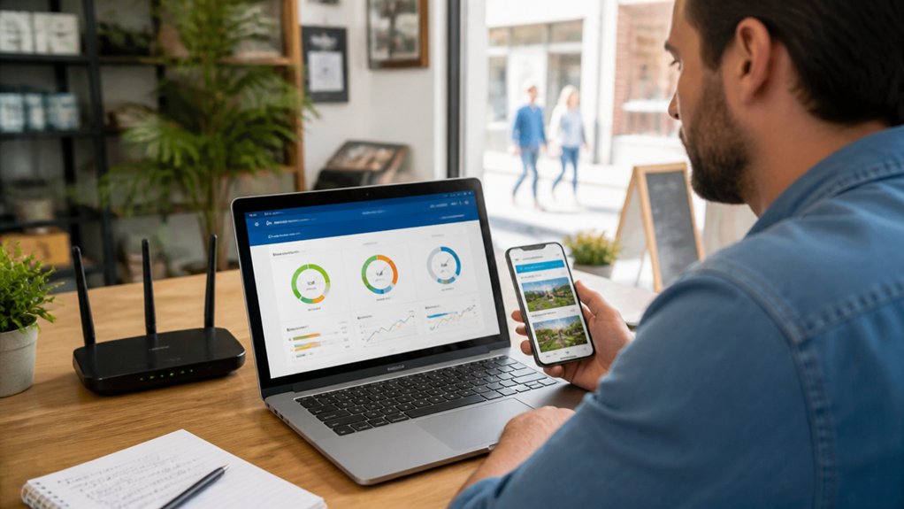
If your site feels slow, you’ll pay for it in higher bounce rates and fewer leads. Core Web Vitals give you three simple speed signals—loading (LCP), interactivity (INP), and visual stability (CLS)—so you can measure what matters.
You can cut load time fast by compressing images, reducing scripts, and using caching and a CDN.
Understand Core Web Vitals
Three numbers tell you most of what you need to know about site speed today: Core Web Essential metrics measure how fast your main content appears (Largest Contentful Paint), how quickly your page responds to a tap or click (Interaction to Next Paint), and how stable the layout stays while it loads (Cumulative Layout Shift).
If LCP runs high, visitors see a blank or partial page longer, and that hurts user engagement. If INP is slow, your site feels broken even when it isn’t. If CLS jumps, people mis-tap buttons, which impacts conversions and page accessibility.
Track these in Google Search Console and PageSpeed Insights, and review real-user data (field metrics), not just lab tests. Set targets, watch trends by template, and validate after each site change.
Improve Load Time Quickly
Even though Core Web Vitals can sound technical, you can cut load time fast by fixing a handful of high-impact essential elements.
Start with Image optimization: resize to display dimensions, compress, and serve WebP/AVIF. Lazy-load below-the-fold images, but preload your hero image so it appears instantly.
Next, reduce server response time by using fast hosting, turning on caching, and adding a CDN; aim for a TTFB under 800 ms.
Minify and defer noncritical JavaScript, and inline critical CSS so above-the-fold content paints quickly.
Limit third-party scripts since each tag adds requests and delays.
Finally, test in PageSpeed Insights and fix the top two issues first; they usually deliver most of the gain quickly.
Navigation That Helps Visitors Find Answers Fast
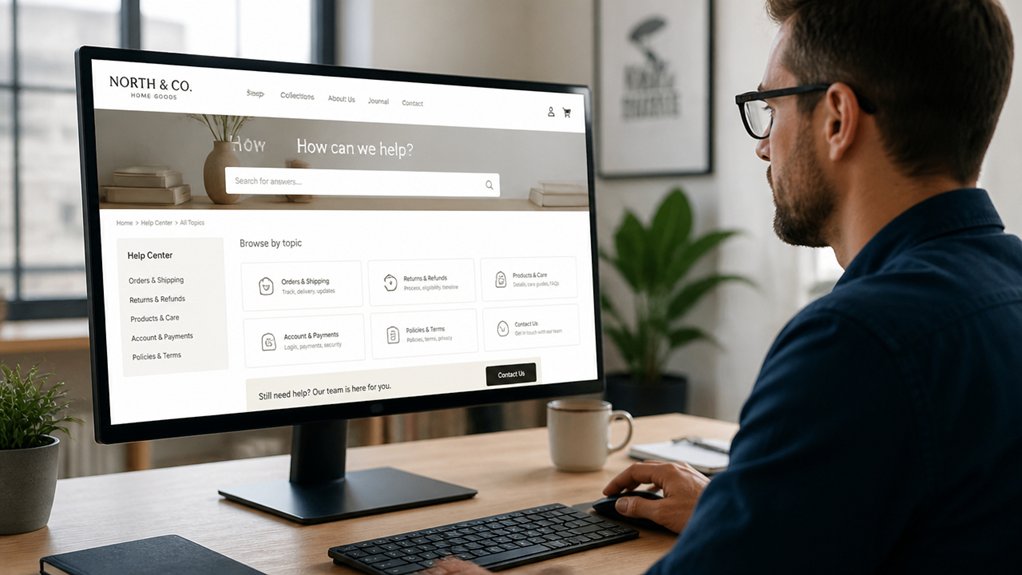
How fast can a visitor get from your homepage to the exact answer they need? If it’s more than three clicks, you’re adding friction and losing trust.
Keep your top navigation to 5–7 items, label them with plain language, and group related pages under one logical dropdown. Put your highest-value info—services, pricing, hours, location, FAQs—where it’s instantly visible.
Use a clear visual hierarchy: consistent menus, bold section headings, and scannable page layouts.
Add site search if you have more than 20 pages, and make it tolerant of typos.
On mobile, use a sticky header and a simple hamburger menu.
Then test: track top exit pages and fix dead ends.
Calls-to-Action That Turn Visits Into Leads
You don’t get leads by hoping visitors “contact you”—you get them by using clear, benefit-driven CTAs like “Get a 10‑minute quote” or “Book a free consult.”
Put those CTAs where decisions happen (top of page, after key benefits, and at the end), and repeat them on long pages.
Make them stand out with strong visual contrast so they’re easy to spot and tap, especially on mobile.
Clear, Benefit-Driven CTAs
When your site makes the next step obvious, more visitors turn into leads. Your CTA should say what happens and why it’s worth it. Use clear messaging that names the outcome: “Get a 15‑minute quote call,” “See pricing,” or “Book service for this week.” Avoid vague buttons like “Submit” or “Learn more” unless the benefit is spelled out nearby.
Tie each CTA to compelling offers and reduce perceived risk: “Get the checklist,” “Start a free estimate,” or “Reserve your spot—no payment today.” Match the language to visitor intent, and keep it specific to one action.
Track click-through and form completion rates, then A/B test wording to lift conversions. Small copy changes can produce measurable gains.
Placement And Visual Contrast
Even the best CTA copy underperforms if it sits below the fold or blends into the page. Put your primary button where eyes land first: top-right of a hero section, next to a key value statement, and repeated after major sections. Track scroll depth and clicks; if users don’t reach the CTA, placement—not messaging—is the bottleneck.
Use visual hierarchy to make the action unmistakable. Give the CTA a contrasting color, larger size, and ample whitespace, while keeping color harmony with your brand palette. Aim for a contrast ratio that’s readable on mobile and accessible.
Limit competing buttons; one primary action per screen typically lifts conversion. Test variations with A/B experiments and keep the winner.
Contact Options: Phone, Forms, Maps, Scheduling
Because customers often decide in seconds whether to reach out, your contact options need to remove friction and make the next step obvious. Put a click-to-call phone number in the header and footer, and label it with hours so you cut missed calls.
Add a short form with three to five fields; fewer fields typically lift submissions. Route form replies to a monitored inbox and set an auto-response with next steps for Customer support.
Embed a map with one-tap directions, plus a “Get directions” link that opens in Google or Apple Maps.
If you book appointments, offer scheduling with real-time availability and confirmation messages to reduce back-and-forth.
For quick questions, add online chat during business hours and a clear offline message when you’re away.
Trust Signals: Reviews, Photos, Certifications
If a visitor can’t quickly verify you’re legit, they’ll bounce and choose the next option. Put proof above the fold: star ratings, review counts, and short Customer testimonials that mention specific outcomes.
Don’t cherry-pick only perfect quotes; include a mix and respond to criticism so buyers see you’re accountable.
Use real photos, not stock. Show your team, your workspace, before-and-after results, and close-ups of finished work. Visual evidence reduces “will they show up?” anxiety and increases contact intent.
Add Industry certifications and memberships where people will notice them: near service descriptions, pricing pages, and checkout or booking steps. Link to issuing bodies when possible.
Finally, keep everything current—old reviews and expired badges signal neglect, not trust.
Small Business SEO + Security Essentials (HTTPS, Schema)
While design and copy help you sell, SEO and security decide whether people find you—and whether they trust the site enough to click “Call” or submit a form. Start with HTTPS: it’s baseline website encryption, and browsers flag non-secure pages. You’ll also protect contact forms and reduce abandoned submissions.
Next, tighten your on-page SEO. Write unique titles and meta descriptions, add descriptive headings, and keep your NAP (name, address, phone) consistent for local search.
Then add schema markup (LocalBusiness, Review, FAQ) so Google can understand your services, hours, and service area; rich results can lift click-through rates even when rankings don’t move.
Finally, submit a sitemap, fix crawl errors, and monitor Search Console monthly. Small fixes compound.
Conclusion
When you build a small business site, you’re not chasing perfection—you’re improving performance. Keep your homepage message clear, your core pages complete, and your mobile design made for tapping, calling, and booking. Prioritize speed so people don’t bounce, and add calls-to-action that are simple and specific. Offer multiple contact options, then back them with trust: reviews, real photos, and credentials. Finally, lock in SEO and security with HTTPS and schema.
About the Author