
Your small business website’s costing you sales if it loads over 3 seconds, shows high bounce rates, and your mobile conversions lag desktop. You’ll lose buyers when product pages fail Core Web Vitals, CTAs like “Call” or “Book” are hard to find, or forms and checkout steps stall. Fix it fast by testing PageSpeed, tap targets, and contact paths in 10 minutes, then compress images and simplify navigation. Keep going to see the exact checks and fixes.
Key Takeaways
- High bounce rates, low time-on-page, and mobile conversions lagging desktop often indicate your website is losing sales.
- Slow load times and poor Core Web Vitals (LCP/INP) make visitors abandon product pages, checkouts, and forms.
- Weak messaging above the fold and vague CTAs like “Learn More” reduce clicks and lower lead or purchase intent.
- Mobile UX issues—tiny tap targets, hard-to-read text, heavy images, and cluttered navigation—cause mis-taps and drop-offs.
- Friction in contact paths (missing click-to-call, slow forms, unclear booking) and low trust signals directly cut calls, bookings, and sign-ups.
Signs Your Small Business Website Is Losing Sales

If your small business website looks “fine” but revenue keeps slipping, the problem often shows up in measurable signals you can’t afford to ignore. You see high bounce rates on key landing pages, low time-on-page, and sharp drop-offs in checkout or form steps. Your mobile conversion rate lags desktop, and Core Web Vitals show slow LCP or high INP, especially on product pages.
Leads come in unqualified because your value proposition isn’t clear and Brand storytelling doesn’t connect benefits to outcomes. You also notice fewer returning visitors, weak email sign-ups, and declining branded search.
Finally, Social media integration fails when posts drive clicks but sessions don’t translate into add-to-carts or calls. Fix the funnels, speed, and message now.
Quick 10-Minute Website Audit (Free Checks)
Run a quick 10-minute audit to spot revenue leaks before you spend more on your small business website.
Check load speed (aim for under 3 seconds), test mobile usability across key pages, and confirm your contact paths work fast—click-to-call, forms, and email links.
If any step fails, you’ve found a concrete fix that can lift conversions without increasing your website costs.
Check Load Speed
Because load time directly affects conversions and ad costs, you should check your site’s speed before spending a dollar on redesigns or new features. Run Google PageSpeed Insights and GTmetrix on your top landing pages and checkout flow; record LCP, INP, and total page weight.
In your website analytics, compare bounce rate and conversion rate for slow pages versus fast ones to quantify revenue loss. If LCP exceeds 2.5 seconds, you’re likely bleeding leads.
Fix the biggest offenders first: compress and resize images, enable caching, defer noncritical scripts, and remove unused plugins. Prioritize content optimization by trimming bloated hero sliders, limiting fonts, and lazy-loading below-the-fold media.
Re-test after each change and keep a simple speed log. Speed wins quickly.
Test Mobile Usability
How does your site behave on a phone when someone tries to buy, book, or call in under 10 seconds? If you don’t know, you’re guessing with revenue.
Start with mobile responsiveness: open your homepage and top landing pages on iOS and Android (or Chrome DevTools). Check that text is readable without zoom, buttons aren’t cramped, and key actions stay above the fold.
Next, run fast usability testing: use Google Lighthouse and PageSpeed Insights to flag tap-target size, layout shifts, and viewport issues.
Then do a two-minute thumb test—scroll, filter, add to cart, and complete one form field. If anything needs pinching, double-taps, or horizontal scrolling, fix it now.
Every extra friction point raises abandonment, especially on mobile.
Verify Contact Paths
Where do leads go when they’re ready to call, book, or request a quote—and can they get there in two taps? In 10 minutes, verify every contact path on mobile and desktop.
Tap your phone number: does it trigger a dialer? Tap your email: does it open compose? Submit your form: do you get a confirmation message and a real email notification? Check your booking link: does it load fast and prefill details where possible?
Next, audit visibility: keep a consistent “Call,” “Book,” or “Get a Quote” button in the header and at the end of key pages. This boosts customer engagement and prevents drop-offs.
Finally, confirm branding consistency on thank-you pages, autoresponders, and voicemail greetings. Don’t let broken paths erase intent.
Why a Slow Website Kills Conversions
Even if your design looks sharp, a slow-loading website drives visitors away before they ever see it. Speed is conversion fuel: when pages lag, attention drops and trust erodes. Research consistently shows that even small delays reduce engagement, and bounce rates climb as load time rises.
If your checkout, booking, or quote form loads late, you’re losing ready-to-buy leads.
You can’t fix this with Website branding alone; performance is part of your promise. Audit your page speed, then cut what’s heavy: oversized images, bloated themes, excessive plugins, and unnecessary scripts. Use caching, compress files, and prioritize above-the-fold content.
Align your content strategy with speed by publishing lean pages that answer intent fast. Measure load time weekly and tie improvements to conversion rate.
Mobile Website Mistakes That Drive Bounces

On mobile, you’re losing customers fast: if your pages take more than 3 seconds to load, most users bounce.
You also push people away when tap targets are too small, forcing mis-taps and extra steps instead of quick actions.
If your text is hard to read without zooming, you’re adding friction that kills engagement and raises your cost per lead.
Slow Load Times
If your mobile site takes more than a few seconds to load, you’re paying for traffic you won’t keep. Mobile visitors bounce fast, and each extra second increases abandonment, shrinking leads and sales. Slow pages also weaken SEO signals, so you’ll spend more on ads just to replace lost organic clicks.
Fix it like you mean it: compress and properly size images, serve next-gen formats, and cut render-blocking scripts. Use caching, a CDN, and lazy-load below-the-fold media. Audit third-party widgets; remove anything that doesn’t drive revenue.
Keep Website branding lightweight—use optimized logos, minimal animations, and system fonts. Boost Content clarity by prioritizing the key offer and trimming heavy, unnecessary elements.
Measure with Core Web Vitals and real-device tests, then repeat monthly.
Tap Targets Too Small
Fast load times won’t save conversions when mobile visitors can’t tap what they came for. If your buttons are tiny or crammed together, you force mis-taps, frustration, and exits.
Research-backed UX guidelines recommend tap targets around 44–48px; anything smaller raises error rates and abandonment. Your Button design should prioritize a single primary action per screen, with generous spacing and clear hit areas that extend beyond the visible label.
Don’t hide critical actions in skinny icons near the edge where thumbs slip. Also audit color contrast: low-contrast buttons look disabled, so users hesitate or miss them entirely.
Fix it fast: enlarge targets, add padding, separate links, and test on real phones with one-hand use. You’ll cut bounces and capture intent.
Hard-To-Read Text
Even when your layout looks polished, hard-to-read mobile text makes users abandon the page because it slows scanning and increases effort. On phones, people skim fast; if your font is thin, cramped, or tiny, they can’t parse value quickly, so they bounce.
Poor Typography clarity also hurts comprehension and trust, especially in pricing, forms, and calls to action.
Fix it with measurable standards: set body text to 16–18px minimum, keep line height around 1.4–1.6, and limit line length to roughly 35–75 characters.
Use clear headings and real bullet lists. Audit color contrast—aim for WCAG AA (4.5:1 for body text) so outdoor glare doesn’t wipe your message.
Then retest on multiple devices and watch time-on-page and conversion rate rise.
Navigation Mistakes That Make People Quit
When your navigation makes people think, they don’t stick around—research shows users often leave a site within seconds if they can’t quickly find what they came for. If your menu is crowded, mislabeled, or hidden behind vague icons, you’re forcing extra clicks and raising bounce rates.
Cut choices to the essentials: Services, Pricing, About, Contact. Use plain labels, keep the header sticky, and make search visible on mobile. Don’t bury high-intent pages under “Learn” or “Resources.”
Add clear pathways for Brand storytelling and Customer testimonials, so buyers can validate trust fast. Track behavior in analytics: menu click-through, time to key pages, and exit pages. Then fix the top drop-off routes, simplify submenus, and test updates weekly to lift conversions and calls.
Messaging Mistakes: Visitors Still Don’t “Get It
If your homepage doesn’t state your value proposition in plain language above the fold, you’re forcing visitors to guess—and most won’t.
When you pack your copy with industry jargon, you increase confusion and spike bounce risk, which drives up your cost per lead.
Spell out who you help, what you do, and the outcome you deliver in one sentence, then replace buzzwords with concrete benefits.
Unclear Value Proposition
One vague headline can tank your website’s ROI because most visitors decide whether to stay or bounce in seconds. If your hero section doesn’t say who you help, what you do, and the outcome you deliver, you’re forcing people to guess—and they won’t.
Your brand messaging should answer three questions immediately: “Is this for me?”, “What’s the promise?”, and “Why trust you?” Without value clarity, clicks don’t turn into calls, carts, or booked consults.
Fix it fast: write a one-sentence promise that includes your audience, your service, and a measurable result or time frame. Add a proof point above the fold (reviews, numbers, logos). Then align your primary CTA with that promise.
Test two headlines and track bounce rate and conversion rate weekly.
Jargon Overload Confusion
Although your offer may be strong, jargon-heavy copy (“full-stack solutions,” “synergistic strategy,” “end-to-end optimization”) makes visitors work too hard to understand what you actually do—and that friction kills conversions.
When people can’t grasp your promise in seconds, they bounce, and you lose the chance to earn trust.
You can’t assume prospects speak your industry jargon or want to decode technical terminology. Every vague buzzword adds cognitive load and raises perceived risk: “If I don’t get this, I shouldn’t buy.”
Fix it by rewriting headlines in plain outcomes, naming who you help, and stating the result you deliver. Replace “innovative platform” with “we set up online booking in 48 hours.” Add one concrete example, one proof point, and a clear CTA.
Your message should feel obvious, not impressive.
CTA Mistakes: What to Say and Where to Place It
Because your site’s CTA directly affects conversion rate, small wording and placement mistakes can quietly inflate your cost per lead and make your website investment look “too expensive.”
You’ll often lose clicks when your button copy stays vague (“Learn More”), competes with too many options, or shows up only once—usually buried at the bottom.
Replace weak labels with outcome-based call to action copy: “Get a Quote in 2 Minutes,” “Book a 15-Min Call,” or “See Pricing.”
Keep one primary action per page and support it with a secondary link only when needed.
Use placement strategies that match attention: put the CTA above the fold, repeat after key benefits, and add it near testimonials or FAQs.
Measure click-through rate and iterate weekly.
Design and Trust Issues That Scare Buyers Off
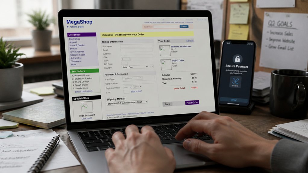
When your site looks dated or inconsistent, buyers don’t wait for an explanation—they bounce and keep shopping. Research shows people form a first impression in about 50 milliseconds, and design drives those judgments fast. If your typography, colors, and imagery clash across pages, you signal chaos, not competence. Lock in visual consistency: one type scale, a tight color palette, and repeatable layout patterns.
Trust also drops when your pages feel generic or “stocky.” You need Brand authenticity: real photos, specific service language, and proof elements that match your claims. Remove clutter, fix broken links, and speed up load times; delays and errors read like risk.
Make your site look maintained, intentional, and credible, and you’ll stop scaring ready-to-buy customers away.
Contact Info and Next-Step Gaps (Calls, Bookings, Maps)
A clean, trustworthy design only pays off if customers can reach you in one tap. If your phone number isn’t click-to-call, you’re forcing extra steps that kill conversions. Put your number, hours, and email in the header and footer, then add a persistent “Call” and “Book Now” button.
If you take appointments, don’t hide scheduling behind a form. Use a real booking link, show next available slots, and confirm instantly.
If you’re local, embed a map, add “Get Directions,” and list parking or entrance notes.
Pair clear Service descriptions with proof: place Customer testimonials beside the primary contact button. Then track taps, form starts, and booking completions so you can fix leaks fast.
Small Business SEO Mistakes That Keep You Off Google
Even if your site looks great, a few common SEO mistakes can keep it buried past page one where most searchers never click. You can’t rank if Google can’t understand your pages: missing title tags, duplicate headings, thin service pages, and no internal links signal low relevance.
You also lose visibility when you target vague keywords instead of “service + city” terms that match intent. Slow load times and non-mobile layouts hurt because Google prioritizes speed and usability.
Fix it with a simple on-page checklist, a clean site structure, and consistent local citations. Then support rankings with Content marketing that answers real questions, and amplify it through social media to earn links and branded searches that lift authority over time.
Form and Checkout Friction (Leads + Ecommerce Fixes)
Because every extra click costs you conversions, form and checkout friction quietly inflates your website’s true cost by turning paid traffic and SEO wins into abandoned leads and carts.
If your lead form asks for 8 fields, you’re likely cutting submissions; strip it to name, email, and one qualifier, then autofill the rest later. Use inline validation, clear error messages, and a single, high-contrast CTA.
For ecommerce, add guest checkout, show total cost early, and offer Apple Pay/Google Pay to reduce payment drop-off.
Keep branding consistency from ad to checkout so visitors don’t question trust. Place Customer testimonials near forms and checkout steps to reduce hesitation.
Track abandonment by step, run A/B tests weekly, and fix the biggest leak first.
Conclusion
If your website loads in over 3 seconds, hides your phone number, or makes mobile users pinch and zoom, you’re handing sales to competitors. Run the 10‑minute audit, then fix speed, mobile layout, navigation, trust signals, and forms in that order. Example: a local plumber cut load time from 6.2s to 2.1s, added a sticky “Call Now” button, and simplified their quote form—weekly leads rose 32% in 30 days. Take action today.
About the Author