
To increase sales fast, you need a clear value proposition above the fold, scannable benefit bullets, and one primary CTA that’s repeated in the right spots. Keep navigation simple (5–7 menu items) and use plain-language labels. Add trust signals—reviews beside claims, guarantees, “as seen in” logos, and security badges near forms. Go mobile-first with sticky buy buttons and wallet payments. Speed up pages with WebP images, lazy-loading, and a CDN. Next, you’ll see the highest-impact fixes to prioritize.
Key Takeaways
- Put a clear value proposition above the fold with scannable benefits, pricing/specs, and a short demo to reduce uncertainty.
- Use simplified navigation and one primary, high-contrast CTA per page, placed consistently above the fold and near decision points.
- Improve speed with compressed WebP/AVIF images, lazy-loading, minimized scripts, caching/CDN, and regular Core Web Vitals monitoring.
- Optimize for mobile with thumb-friendly layouts, large tap targets, sticky purchase buttons, click-to-call, and fast wallet-ready checkout options.
- Build trust and reduce friction with testimonials, certifications, security badges, transparent returns, guest checkout, autofill, and short forms with immediate follow-ups.
Highest-Impact Small Business Website Features to Fix First

If you want your website to generate more leads fast, start by fixing the handful of features that consistently move the needle: a clear value proposition above the fold, a single obvious call-to-action, mobile speed (aim for sub–3-second loads), and trust signals like reviews and guarantees.
Next, tighten your messaging so visitors instantly know who you help, what you deliver, and why you’re credible. Use Brand storytelling to frame the problem, your approach, and the result in 2–3 scannable lines, not a long “About” essay.
Reinforce it with visual branding: consistent colors, readable type, and photos that match your audience, which can lift perceived trust and reduce bounce.
Then audit friction: simplify forms, remove pop-ups, and ensure key pages load seamlessly on mobile.
Small Business Website CTAs and Navigation That Drive Action
If your site’s navigation and CTAs aren’t crystal clear, you’ll lose clicks before you ever get a lead.
You’ll want one primary call-to-action that stands out, a streamlined menu that keeps choices limited, and buttons placed where people naturally decide—top of page, key scroll points, and near pricing or service details.
Get those three right, and you’ll turn more visits into calls, bookings, and purchases.
Clear Primary Call-To-Action
One clear primary call-to-action (CTA) can lift your conversion rate because it tells visitors exactly what to do next—no guesswork, no competing buttons. Pick one goal per page (Book a Call, Get a Quote, Buy Now) and make it impossible to miss above the fold.
Use contrasting color, ample white space, and a short, action-first label; tests often show specific CTAs outperform generic “Submit” by 10–30%. Keep supporting copy tight: one sentence on the outcome and one on the next step.
Reinforce trust with brand storytelling (a one-line proof point) and visual branding (consistent button style, icon, and tone) so the CTA feels credible, not pushy.
Then track clicks and completion rate, and iterate weekly for steady gains.
Streamlined Menu Structure
A strong primary CTA only works when visitors can actually find it—and your menu either clears the path or creates friction. Keep your Navigation hierarchy shallow: aim for 5–7 top-level items, because overloaded navs increase choice paralysis and drop engagement.
Label items with plain language your customers use, not internal jargon.
Use Menu categorization to group related pages and reduce scanning time: “Services,” “Pricing,” “About,” “Contact,” and “Resources” beat scattered single-page links. Put your highest-intent pages one click from the homepage, and keep dropdowns to one level so mobile users don’t mis-tap.
Add a consistent “Start Here” or “Solutions” hub if you offer multiple services.
Finally, audit your menu quarterly: remove low-traffic links and rename confusing labels based on analytics and search queries.
Action-Focused Button Placement
Because visitors scan before they read, your buttons need to show up where their eyes naturally land and where intent peaks. Put your primary CTA above the fold, near your headline, and repeat it after key benefit sections so you catch decision moments.
Use one dominant button style to protect your Visual branding and reduce choice overload; secondary actions should look quieter. Keep labels specific: “Get a Quote” beats “Submit.”
Size and contrast matter, but don’t rely on color alone—add whitespace and clear icons for accessibility. Build Interactive design by pairing CTAs with micro-feedback (hover, pressed states) so clicks feel confirmed.
On mobile, stick CTAs near thumbs and keep them visible after scroll. Test placement with heatmaps and simple A/B swaps.
Small Business Website Trust Signals (Reviews, Guarantees, Badges)
After you’ve built clear CTAs and navigation, you’ve got to earn trust fast—buyers often look for proof before they click “Buy” or “Book.” Put your guarantee and return policies in plain language where people decide, and you’ll reduce friction and chargebacks.
Then add recognizable security and certification badges (SSL, payment providers, industry memberships) near forms and checkout so visitors know their data’s protected.
Guarantee And Return Policies
Even if your product’s great, shoppers hesitate when they can’t see what happens if it doesn’t work out, so a clear guarantee and return policy becomes an immediate trust signal. Put your Guarantee policies on product pages and at checkout, not buried in a footer. Spell out the promise in one sentence, then link to details.
Make Return procedures frictionless: list the time window, condition rules, refund timing, and who pays shipping. Add a simple 3-step timeline (Request → Ship/Drop-off → Refund) and set expectations with real numbers (e.g., “refunds processed in 3–5 business days”). Offer prepaid labels or easy exchanges when possible—reducing perceived risk often lifts conversion.
Finally, highlight exceptions upfront so customers don’t feel surprised or trapped later.
Security And Certification Badges
Why do security and certification badges matter so much at checkout? Because you’re asking shoppers to share payment details at the exact moment doubt can kill the sale.
When you display recognizable SSL, PCI, and payment-provider badges near the cart and form fields, you reduce perceived risk and friction. Even small cues can lift conversions, especially on mobile, where buyers skim fast and abandon faster.
Use badges you can verify: HTTPS padlock, “Secure Checkout,” PCI-compliant processing, and trusted gateways like PayPal, Apple Pay, or Stripe. Place them beside the “Pay” button, not buried in the footer.
Keep the set tight—too many logos look spammy. When you back up visuals with clear privacy and security links, you protect brand reputation and reinforce customer loyalty over time.
Mobile-First Small Business Website Features for Fast Buying
When most shoppers land on your site from a phone, every extra tap and second of load time costs you sales. Build a thumb-first layout: sticky “Add to Cart,” large tap targets, and a one-screen product summary (price, stock, delivery date).
Use wallet-ready checkout (Apple Pay/Google Pay), autofill, and address validation so buyers finish in under a minute.
Add click-to-call and tap-to-map for high-intent visitors who want answers now.
Support Voice search so customers can find “same-day pickup” items hands-free and convert faster.
For visual shoppers, Augmented reality previews reduce uncertainty and returns by showing scale and fit.
Keep forms short, make guest checkout default, and surface trust cues near the buy button.
Small Business Website Speed Features That Cut Load Time
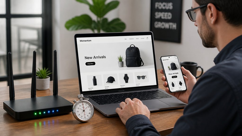
Mobile-first buttons and one-tap checkout won’t matter if your pages drag—53% of mobile visits get abandoned after 3 seconds of load time. To keep buyers moving, you’ve got to engineer speed into every template, not just your homepage.
Start with Image optimization: serve WebP/AVIF, compress aggressively, and size images to the exact display width. Lazy-load below-the-fold media so the first screen renders fast.
Next, cut heavy scripts: remove unused plugins, defer noncritical JavaScript, and inline critical CSS.
Improve server response by using caching, a CDN, and a hosting plan that doesn’t throttle traffic spikes.
Finally, monitor Core Web Vitals weekly; if LCP or INP slips, you’ll see it in drop-offs and conversions.
Product and Service Page Features That Answer “Why You
Even if your speed scores look great, shoppers still bounce if your product and service pages don’t quickly prove you’re the right choice. Lead with a crisp value proposition above the fold: who it’s for, what it solves, and what makes you different.
Use scannable benefit bullets, clear specs, pricing context, and comparison tables so visitors can decide fast. Add strong visuals and short demo clips to reduce uncertainty and returns.
Build trust with Customer testimonials placed next to the exact claim they support—results, timelines, reliability. Include proof signals like certifications, guarantees, and “as seen in” logos.
Finally, use Personalized recommendations (“Pairs well with…,” “Best for…”) to guide browsing and lift average order value without feeling pushy or salesy.
Checkout and Lead-Capture Features That Reduce Drop-Offs
Although your product pages may convince visitors, you’ll still lose revenue if checkout or lead forms feel slow, confusing, or risky. Reduce friction with a one-page checkout, guest purchase, and autofill for address and card details.
Show security badges, clear return policies, and real-time shipping/tax totals to prevent surprise costs. Offer flexible Payment options—credit/debit, digital wallets, Buy Now Pay Later, and local methods—so customers don’t abandon at the final step.
For lead capture, keep forms short: name, email, one qualifying question. Add inline error messages and progress indicators on multi-step forms.
Trigger fast follow-ups: confirmation emails, SMS options, and segmented drip sequences for lead nurturing. Track drop-off by step, A/B test fields, and fix the worst-performing screens.
Conclusion
When you fix the right website features first, you don’t just “improve your site”—you make it easier for customers to buy. Start with clear CTAs, trust signals, mobile-first pages, and faster load times, then tighten your product pages and checkout so nothing feels confusing. One stat worth remembering: a 1‑second delay can reduce conversions by about 7%. Keep testing, keep simplifying, and you’ll turn more visits into sales.
About the Author